
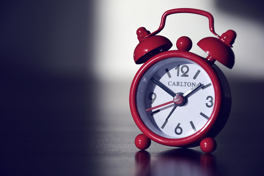
A classic red twin-bell alarm clock sits on a dark, reflective surface with a blurred background. The image features strong contrast and ample negative space, ideal for concepts related to time, deadlines, and waking up.
Tags:
PHOTO INFO
- Image Size
- 6000x4000px
- File Size
- 1.1MB
- resolution
- 5K
- License
- Commercial use free
- Aesthetic Score
- 88/100
VISUAL ATTRIBUTES OF THIS STOCK PHOTO
- Color temperature
- cool
- Brightness
- mid_tone
- Saturation
- vibrant
- Lighting Source
- studio
- Lighting Condition
- indoor
- Negative Space
- large
- Negative Space Location
- left
- Depth Of Field
- shallow
- Has People
- none
- Season
- unknown
- Time Of Day
- unknown
- Shot Scale
- close_up
- Background Type
- blurred_bokeh
- Orientation
- horizontal
- Composition Style
- rule_of_thirds
- Dominant colors
- redwhitegrayblack
- Palette Style
- vibrantdark_moody
- Mood
- dramaticprofessional
- Style
- product_photographystudio
- Subject type
- product
ONLINE RESIZE
aesthetic analysis & score
This is a high-quality stock image with excellent composition, lighting, and color contrast that makes it highly versatile for editorial and commercial use.
Composition & Framing score
90The subject is placed on the right third, creating a balanced composition with significant negative space on the left for text overlay.
Lighting & exposure score
85Dramatic lighting highlights the clock's form and texture while casting deep shadows that add depth and mood.
Color harmony & palette score
88The vibrant red of the clock contrasts sharply with the cool, dark blue-gray background, creating a visually striking and harmonious palette.
Visual impact & mood score
86The moody lighting and bold color create a strong visual impact, evoking a sense of urgency or importance.
Technical Quality & Clarity score
92The image is sharp with excellent detail on the clock face and body, showing high technical execution.
Subject clarity & focal hierarchy score
95The clock is the undeniable focal point, clearly separated from the background by lighting and depth of field.
Use case suitability scores
Copyspace Layout Usability Score
95This image is suitable for text overlay layouts — the negative space in the left works for posters, banners, greeting cards and magazine covers needing headline room
Social Media Content Creation Score
80Web UI Digital Design Score
85This image is suitable for web UI and digital design projects — website hero sections, app splash screens, email headers, and UI mood boards
Commercial Advertising Branding Score
82Editorial Corporate Presentation Score
90This image is suitable for editorial and corporate presentations — slide decks, annual reports, press releases, internal newsletters and conference presentation backgrounds
Content Marketing Publishing Score
88This image is suitable for content marketing and publishing — pairs with blog posts, article featured images, podcast covers, ebook covers and video thumbnails across publishing platforms
Ecommerce Product Showcase Score
75Market Competitiveness Score
85Related Royalty free Photos
-
aesthetic:85
3200x2133px
Vintage Black Alarm Clock on Rustic Wooden Background -
aesthetic:88
3916x5866px
Minimalist alarm clock on pastel pink and blue background -
aesthetic:85
6144x4069px
Hand holding small white alarm clock on white background -
aesthetic:85
3084x2056px
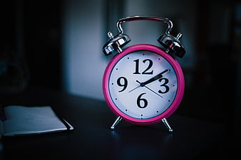
Pink analog alarm clock on dark desk with notebook -
aesthetic:82
3936x2624px
Vintage Black Alarm Clock on Wooden Surface -
aesthetic:82
5472x3648px
Vintage black alarm clock on modern office desk with laptop -
aesthetic:88
5952x3926px
Colorful alarm clocks on white background -
aesthetic:85
6016x4016px
Vintage Blue Alarm Clock on Wooden Shelf -
aesthetic:90
3021x2232px
Red Vintage Alarm Clock on White Background -
aesthetic:85
4928x3264px
Vintage White Alarm Clock on Plaid Bedding in Black and White -
aesthetic:88
3021x2232px
Red Alarm Clock Ringing with Motion Blur and Lightning Bolts -
aesthetic:78
5472x3648px
Close-up of vintage clock face with roman numerals and 24-hour markings -
aesthetic:85
5976x3915px
Vintage Alarm Clock and White Coffee Cup on Wooden Table -
aesthetic:88
5761x3841px

Vintage black and white alarm clock on textured surface -
aesthetic:82
5500x3385px
Vintage Rusty White Alarm Clock on White Background -
aesthetic:88
5359x3573px
Pink hourglass with vintage clock measuring time -
aesthetic:82
4288x2848px
Vintage Veglia Alarm Clock on White Background -
aesthetic:85
4756x3501px
Vintage Gold Alarm Clock on Colorful Wooden Background -
aesthetic:85
6016x3970px
Vintage teal alarm clock on wooden surface with blurred background -
aesthetic:82
6016x3703px
Vintage White Rusty Alarm Clock on White Background -
aesthetic:82
2000x1333px
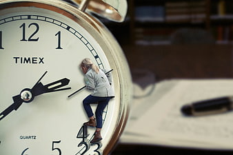
Tiny woman climbing giant alarm clock face -
aesthetic:88
5239x3378px
Vintage Blue Retro Alarm Clock on White Background -
aesthetic:82
5552x3320px
Vintage Blue Alarm Clock on White Wooden Background -
aesthetic:78
5472x3648px

Black alarm clock on desk with laptop and office supplies -
aesthetic:85
6000x3915px

Creative coffee clock concept with morning light -
aesthetic:87
5585x3771px
Vintage Green Alarm Clock in Spotlight -
aesthetic:82
3500x2333px
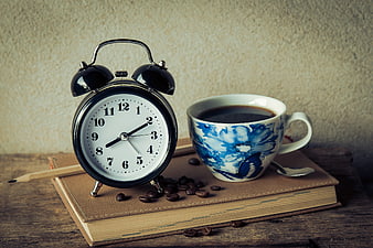
Vintage alarm clock and coffee cup on a book -
aesthetic:85
6000x4000px
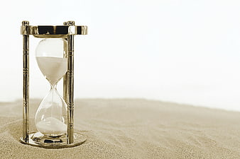
Gold Hourglass on Sand with White Background -
aesthetic:78
4194x2454px
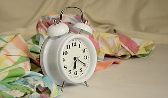
White Alarm Clock on Colorful Bedding -
aesthetic:85
3508x2481px
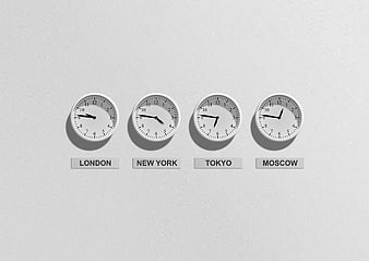
Four Wall Clocks Showing Different Time Zones on White Wall -
aesthetic:84
3000x1995px
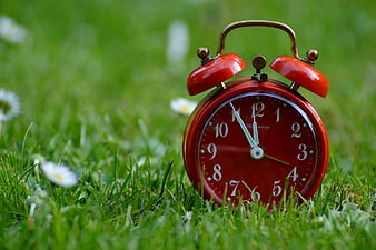
Red Vintage Alarm Clock on Green Grass with Daisies -
aesthetic:88
1920x1271px
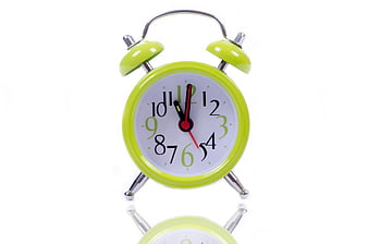
Green Retro Alarm Clock Isolated on White Background -
aesthetic:86
6000x3915px
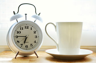
White Alarm Clock and Coffee Cup on Wooden Table -
aesthetic:88
5853x2438px
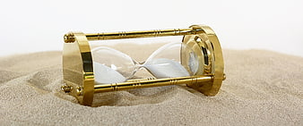
Gold hourglass lying on sand representing time -
aesthetic:82
4000x5196px
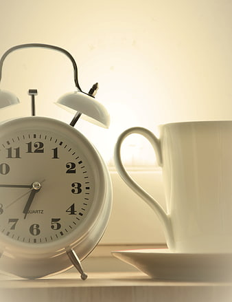
White alarm clock and coffee cup on windowsill with morning light -
aesthetic:85
6000x4000px
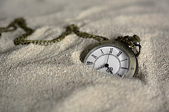
Vintage pocket watch half buried in sand -
aesthetic:85
6016x3970px
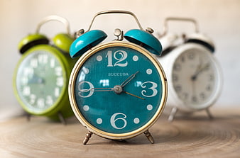
Vintage teal alarm clock with blurred green and white clocks -
aesthetic:85
6016x4016px
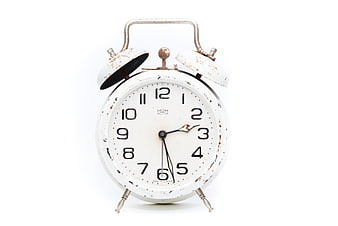
Vintage White Alarm Clock with Rust Details on White Background -
aesthetic:85
5239x3247px
Vintage Blue Alarm Clock on White Background -
aesthetic:82
5184x3456px
Vintage Silver Alarm Clock on Black Background -
aesthetic:85
5436x3598px
Vintage Green Alarm Clock on White Background -
aesthetic:78
3264x4928px
Close-up of analog clock face showing time near twelve -
aesthetic:78
5472x3648px
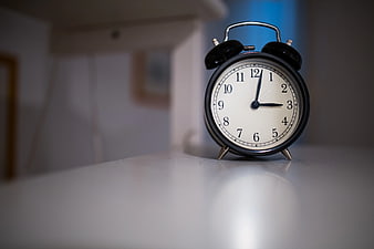
Black Alarm Clock on White Surface with Copyspace -
aesthetic:85
6016x4000px
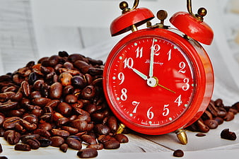
Red Alarm Clock Surrounded by Coffee Beans -
aesthetic:92
3275x2465px
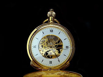
Gold Skeleton Pocket Watch on Black Background -
aesthetic:88
5239x3378px
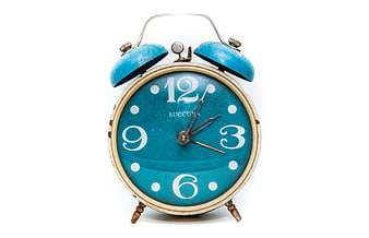
Vintage Blue Alarm Clock on White Background -
aesthetic:80
4208x2776px
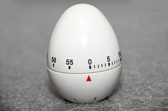
White egg-shaped kitchen timer on gray background -
aesthetic:85
3885x5827px
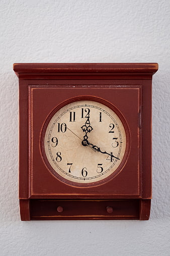
Vintage Wooden Wall Clock on White Textured Background -
aesthetic:82
4149x3235px
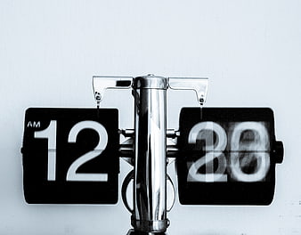
Close-up of vintage flip clock showing 12:20 AM -
aesthetic:78
5184x3456px
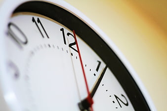
Close-up of analog clock face showing time near twelve o'clock -
aesthetic:84
3056x2304px
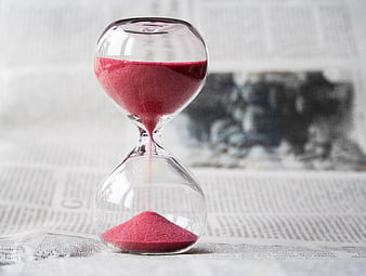
Red Sand Hourglass on Newspaper Background -
aesthetic:82
4711x3456px
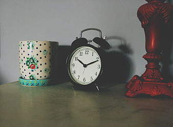
Vintage alarm clock, floral mug, and red lamp on a table -
aesthetic:82
4272x2848px

Vintage industrial clock hanging from glass ceiling structure -
aesthetic:88
3952x2529px
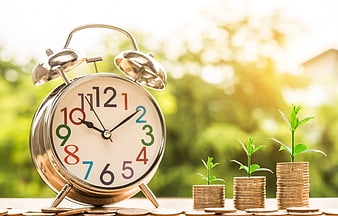
Alarm clock and growing coin stacks with plants -
aesthetic:78
6000x4000px
Vintage Gold Alarm Clocks Background Pattern -
aesthetic:82
5184x3456px
Close-up of calendar with circled date 18 SA -
aesthetic:82
3425x2480px
Vintage Silver Pocket Watch with Chain on Rustic Background -
aesthetic:85
9000x6000px
Close-up of analog quartz clock face on black background -
aesthetic:80
1577x1700px
Vintage White Mantel Clock on Wooden Shelf -
aesthetic:85
6000x4000px
Silver alarm clock on stone wall with blurred yellow flowers