
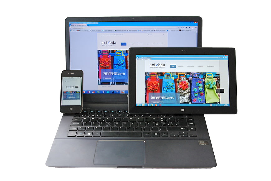
A collection of electronic devices including a laptop, tablet, and smartphone displaying a responsive e-commerce website. The screens show colorful shopping bags, illustrating cross-platform web design and mobile compatibility.
Tags:
PHOTO INFO
- Image Size
- 3872x2592px
- File Size
- 1.64MB
- resolution
- 4K
- License
- Commercial use free
- Aesthetic Score
- 82/100
VISUAL ATTRIBUTES OF THIS STOCK PHOTO
- Color temperature
- neutral
- Brightness
- high_key
- Saturation
- moderate
- Lighting Source
- studio
- Lighting Condition
- indoor
- Negative Space
- large
- Negative Space Location
- surrounding
- Depth Of Field
- deep
- Has People
- none
- Season
- unknown
- Time Of Day
- unknown
- Shot Scale
- medium
- Background Type
- solid_color
- Orientation
- horizontal
- Composition Style
- centered
- Dominant colors
- blackwhiteblueredgreen
- Palette Style
- natural
- Mood
- professional
- Style
- product_photography
- Subject type
- computersmartphonetechnology
ONLINE RESIZE
aesthetic analysis & score
This is a high-quality, professional stock image that effectively communicates the concept of responsive web design through a clean and well-lit composition of multiple devices.
Composition & Framing score
85The devices are arranged in a clear, hierarchical pyramid structure that effectively demonstrates the concept of responsive design across different screen sizes.
Lighting & exposure score
90The lighting is even and bright, eliminating harsh shadows and ensuring all screens and device details are clearly visible against the white background.
Color harmony & palette score
80The neutral tones of the hardware contrast well with the vibrant colors on the screens, creating a balanced and professional look.
Visual impact & mood score
75The image conveys a professional and modern mood suitable for technology and business contexts, though it is somewhat generic.
Technical Quality & Clarity score
92The image is sharp and high-resolution, with clear text and graphics visible on all three device screens.
Subject clarity & focal hierarchy score
88The focal point is clearly the screens displaying the website, with the devices serving as the context for the responsive design concept.
Use case suitability scores
Copyspace Layout Usability Score
60Social Media Content Creation Score
75Web UI Digital Design Score
90This image is suitable for web UI and digital design projects — website hero sections, app splash screens, email headers, and UI mood boards
Commercial Advertising Branding Score
85This image is suitable for commercial advertising and branding — brand campaigns, display ads, product packaging, brochures, and outdoor billboard visuals
Editorial Corporate Presentation Score
88This image is suitable for editorial and corporate presentations — slide decks, annual reports, press releases, internal newsletters and conference presentation backgrounds
Content Marketing Publishing Score
80Ecommerce Product Showcase Score
70Market Competitiveness Score
85Related Royalty free Photos
-
aesthetic:85
3594x2387px
White tablet and smartphone mockup on gray surface -
aesthetic:76
3000x2000px
Hands using tablet and laptop for online shopping -
aesthetic:80
3500x1969px
Laptop displaying online shopping website on glass desk -
aesthetic:72
1920x1280px
Man using smartphone with green screen on grass -
aesthetic:82
3000x3000px
Gray line art icon of desktop, laptop, tablet, and smartphone -
aesthetic:78
5472x3648px
Laptop and smartphones displaying website on dark table -
aesthetic:72
3626x2408px
Person using smartphone and laptop with accounting website on screen -
aesthetic:78
3872x2592px
Flat lay workspace with laptop, tablet, smartphone, and notebook on wooden desk -
aesthetic:75
5456x3064px

Close-up of HTML code on a computer screen -
aesthetic:82
4071x2714px
White tablet and smartphone on white marble background -
aesthetic:76
4112x2731px
Tablet and Smartphone on Wooden Table with Blurred Background -
aesthetic:68
6016x4016px

Close-up of Ruby code on laptop screen with office background -
aesthetic:78
3964x2633px
MacBook, iPad, and iPhone on wooden desk workspace -
aesthetic:78
3991x2651px
Hands typing on laptop with tablet and smartphone mockup -
aesthetic:78
3000x1960px
Tablet displaying purple honeycomb design on wooden desk with coffee -
aesthetic:88
7680x5120px

Woman online shopping on laptop and smartphone at home -
aesthetic:78
4608x3456px
Flat lay of laptop, smartphone, and tablet on wooden desk -
aesthetic:82
2800x2100px
White tablet computer displaying website on white background -
aesthetic:82
5547x3698px

Person holding credit card while typing on laptop for online shopping -
aesthetic:72
3958x2629px
Laptop and tablet displaying business software on wooden desk -
aesthetic:78
4288x2848px
Modern Apple Workspace with iMac, MacBook, and iPad on Desk -
aesthetic:76
1920x1281px
Samsung tablet displaying Google search homepage on screen -
aesthetic:88
5388x3493px
Black Tablet and Stylus on White Textured Fabric -
aesthetic:82
1920x1281px

Tablet displaying Twitter welcome screen on desk -
aesthetic:78
3000x2000px

Close-up of computer programming code on a monitor screen -
aesthetic:76
5456x3632px
Close-up of tablet and spiral notebook on wooden desk -
aesthetic:75
5456x3064px

Close-up of HTML code on a dark computer screen -
aesthetic:78
4599x3764px

Hand holding tablet with online marketing SEO strategy diagram -
aesthetic:85
4608x3456px
Silver iPhone and White Wireless Earbuds on White Background -
aesthetic:80
2660x1577px
Modern wooden desk setup with iMac, keyboard, and mouse -
aesthetic:82
4032x3024px

Flat lay of HTML CSS book, laptop, and notebook on white desk -
aesthetic:82
3145x2222px

Magnifying glass over Google search engine logo on computer screen -
aesthetic:78
3964x2633px
MacBook Pro, iPad, and iPhone on Wooden Desk -
aesthetic:75
3802x2525px
Woman Typing on MacBook Air with Coffee -
aesthetic:78
3200x1400px

Online Shopping Concept with Hands Exchanging Money and Bag from Laptops -
aesthetic:85
2500x2000px
iMac displaying Facebook business page on wooden desk -
aesthetic:78
4288x2848px
Hands holding tablet with Google search page in cafe -
aesthetic:92
3432x3432px
White Smartphone with Colorful Yay Screen on Desk -
aesthetic:80
4276x3441px
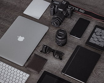
Flat lay of photographer workspace with camera, laptop, and accessories -
aesthetic:78
5265x3510px

Man coding on laptop at wooden table with tablet and plant -
aesthetic:80
3777x2034px
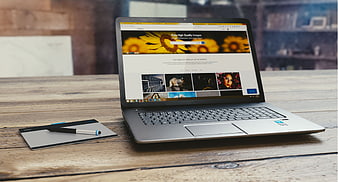
Laptop and Graphics Tablet on Wooden Desk -
aesthetic:82
4000x2352px
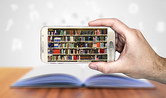
Hand holding smartphone with digital library bookshelf screen -
aesthetic:78
3500x1500px
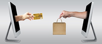
Online Shopping Concept with Credit Card and Shopping Bag -
aesthetic:82
6000x4000px
Overhead view of person using laptop on white desk -
aesthetic:82
5378x3585px
White Smartphone Mockup on Wooden Table Surface -
aesthetic:78
3769x2513px

Close-up of computer code syntax highlighting on dark screen -
aesthetic:85
2592x1728px
White Smartphone Mockup with Black Screen on White Background -
aesthetic:82
5472x3648px

Hand holding red credit card near laptop for online shopping -
aesthetic:78
5184x3456px
White smartphone and tablet on wooden surface -
aesthetic:78
3840x2160px
Laptop displaying YouTube homepage on screen -
aesthetic:72
3000x2000px
Smartphone displaying user registration login screen on concrete -
aesthetic:76
5184x3456px
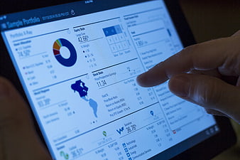
Hand interacting with financial portfolio app on tablet screen -
aesthetic:75
4627x2987px
Flat lay of MacBook Air with WordPress dashboard, smartphone, notebook, and coffee on wooden desk -
aesthetic:82
2180x1453px
Hand holding white smartphone with galaxy wallpaper -
aesthetic:85
6478x4323px
Silver laptop with blank white screen on white background -
aesthetic:86
5168x3445px
High angle view of laptop workspace with coffee and notebook -
aesthetic:78
6000x4000px
Computer Monitor Displaying Pexels Website in Office -
aesthetic:85
3594x2387px
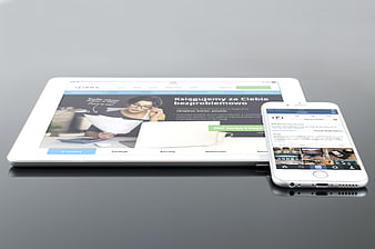
White tablet and smartphone displaying responsive website on gray surface -
aesthetic:82
5772x3848px
Minimalist workspace with tablet, keyboard, and notebook -
aesthetic:75
4608x3456px
Close-up of tablet screen with app icons and battery indicator