
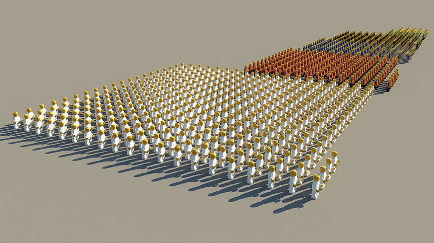
A 3D rendered illustration of a large crowd of stylized people arranged in a bar chart formation on a neutral background. The figures are color-coded in white, red, blue, and yellow to represent statistical data, election results, or market share. Ideal for business presentations, data visualization, and infographic design.
Tags:
PHOTO INFO
- Image Size
- 3200x1800px
- File Size
- 704.07KB
- resolution
- 2K
- License
- Commercial use free
- Aesthetic Score
- 78/100
VISUAL ATTRIBUTES OF THIS STOCK PHOTO
- Color temperature
- neutral
- Brightness
- mid_tone
- Saturation
- moderate
- Lighting Source
- studio
- Lighting Condition
- indoor
- Negative Space
- large
- Negative Space Location
- top_left
- Depth Of Field
- deep
- Has People
- crowd
- Season
- unknown
- Time Of Day
- unknown
- Shot Scale
- wide
- Background Type
- solid_color
- Orientation
- horizontal
- Composition Style
- diagonal
- Dominant colors
- whiteredblueyellowgray
- Palette Style
- vibrant
- Mood
- professional
- Style
- conceptual
- Subject type
- crowd
ONLINE RESIZE
aesthetic analysis & score
This is a highly functional and visually clear 3D illustration that effectively communicates statistical concepts through its organized composition and distinct color coding.
Composition & Framing score
85The diagonal arrangement of the crowd creates a strong leading line that guides the eye across the frame effectively.
Lighting & exposure score
80The lighting is even and consistent, casting clear shadows that ground the figures without creating harsh contrast.
Color harmony & palette score
75The distinct color blocks of white, red, blue, and yellow provide clear visual separation for data representation against the neutral background.
Visual impact & mood score
70The image conveys a professional and analytical mood suitable for business contexts, though it lacks emotional depth.
Technical Quality & Clarity score
90The 3D rendering is clean and sharp, with no visible artifacts or noise, ensuring high clarity for the subject matter.
Subject clarity & focal hierarchy score
85The subject is immediately recognizable as a data visualization tool, with the color-coded sections clearly distinguishing different data sets.
Use case suitability scores
Copyspace Layout Usability Score
85This image is suitable for text overlay layouts — the negative space in the top_left works for posters, banners, greeting cards and magazine covers needing headline room
Social Media Content Creation Score
70Web UI Digital Design Score
80Commercial Advertising Branding Score
75Editorial Corporate Presentation Score
95This image is suitable for editorial and corporate presentations — slide decks, annual reports, press releases, internal newsletters and conference presentation backgrounds
Content Marketing Publishing Score
85This image is suitable for content marketing and publishing — pairs with blog posts, article featured images, podcast covers, ebook covers and video thumbnails across publishing platforms
Ecommerce Product Showcase Score
10Market Competitiveness Score
80Related Royalty free Photos
-
aesthetic:78
3200x1800px
3D Isometric Crowd Groups Statistics Visualization -
aesthetic:88
3000x2000px

Futuristic 3D Financial Growth Chart with Neon Glow -
aesthetic:82
6656x3744px

Young woman pointing at growth chart on blue background -
aesthetic:72
4002x2668px
Tablet and printed analytics reports on wooden desk -
aesthetic:82
6000x6000px

3D Man Pulling Green Slice from White Pie Chart -
aesthetic:78
6000x4000px

Hand holding magnifying glass over blue 3D bar chart -
aesthetic:82
6000x6000px

3D Business Growth Concept with Helping Hands on Green Chart -
aesthetic:82
6000x6000px

3D Character Climbing Orange Bar Chart Steps -
aesthetic:82
6000x6000px

3D Man Climbing Orange Bar Chart Stairs -
aesthetic:82
6000x6000px

3D Character Climbing Red Bar Graph Steps -
aesthetic:82
6000x6000px

3D Business Growth and Teamwork Concept on Bar Chart -
aesthetic:65
6000x3601px

Business problem analysis solution concept with team silhouettes -
aesthetic:78
5184x3456px

Colorful wooden game pieces on white background