
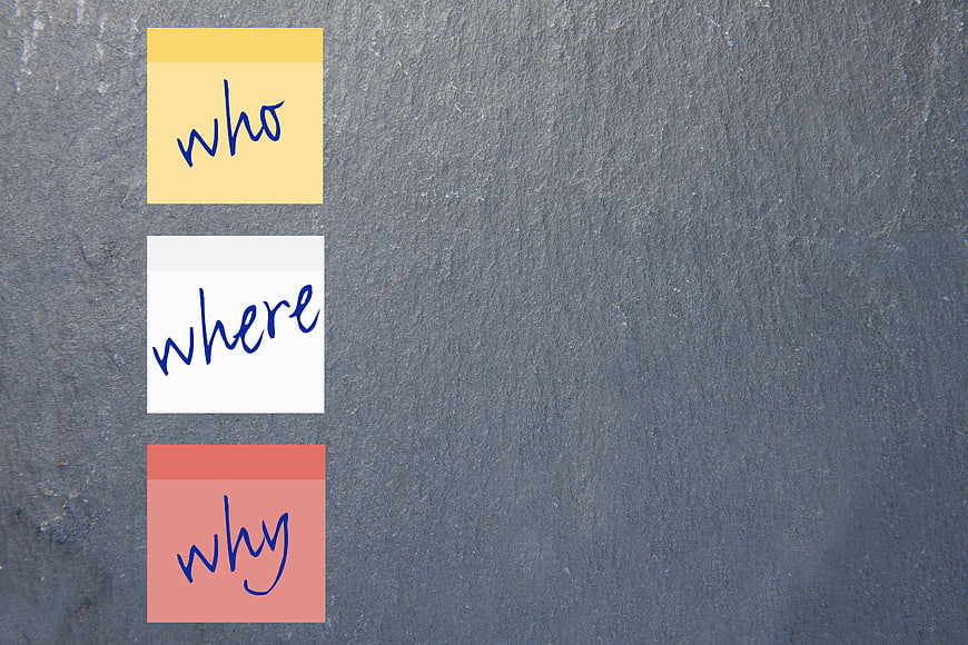
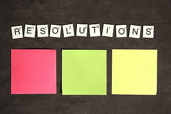
Three colorful sticky notes with handwritten questions on a textured gray slate background. Ideal for business strategy, brainstorming, and educational concepts.
Tags:
PHOTO INFO
- Image Size
- 4752x3168px
- File Size
- 2.58MB
- resolution
- 4K
- License
- Commercial use free
- Aesthetic Score
- 82/100
VISUAL ATTRIBUTES OF THIS STOCK PHOTO
- Color temperature
- neutral
- Brightness
- mid_tone
- Saturation
- moderate
- Lighting Source
- natural
- Lighting Condition
- indoor
- Negative Space
- large
- Negative Space Location
- right
- Depth Of Field
- deep
- Has People
- none
- Season
- unknown
- Time Of Day
- unknown
- Shot Scale
- close_up
- Background Type
- textured
- Orientation
- horizontal
- Composition Style
- minimalrule_of_thirds
- Dominant colors
- grayyellowwhitered
- Palette Style
- naturalvibrant
- Mood
- professionalcalm
- Style
- minimalistconceptual
- Subject type
- still_lifebackground
ONLINE RESIZE
aesthetic analysis & score
This is a highly effective conceptual image that balances visual interest with significant functional utility. The strong contrast between the colorful notes and the textured slate background makes it a versatile and commercially viable asset for business and educational contexts.
Composition & Framing score
85The vertical alignment of the notes on the left creates a strong visual anchor, while the expansive negative space on the right offers excellent balance and layout potential.
Lighting & exposure score
80Even, diffuse lighting illuminates the scene without harsh shadows, ensuring the text is legible and the texture of the slate is clearly visible.
Color harmony & palette score
85The vibrant yellow, white, and salmon notes provide a striking, high-contrast pop of color against the neutral, textured gray background.
Visual impact & mood score
75The composition conveys a professional yet creative mood, effectively communicating themes of inquiry and strategic planning.
Technical Quality & Clarity score
90The image is sharp and high-resolution, with crisp edges on the paper and clear, legible handwriting.
Subject clarity & focal hierarchy score
90The bright, colorful notes immediately draw the eye, establishing a clear focal point against the muted, uniform background.
Use case suitability scores
Copyspace Layout Usability Score
95This image is suitable for text overlay layouts — the negative space in the right works for posters, banners, greeting cards and magazine covers needing headline room
Social Media Content Creation Score
80Web UI Digital Design Score
85This image is suitable for web UI and digital design projects — website hero sections, app splash screens, email headers, and UI mood boards
Commercial Advertising Branding Score
75Editorial Corporate Presentation Score
90This image is suitable for editorial and corporate presentations — slide decks, annual reports, press releases, internal newsletters and conference presentation backgrounds
Content Marketing Publishing Score
85This image is suitable for content marketing and publishing — pairs with blog posts, article featured images, podcast covers, ebook covers and video thumbnails across publishing platforms
Ecommerce Product Showcase Score
20Market Competitiveness Score
80Related Royalty free Photos
-
aesthetic:78
8000x2666px
Woman writing question words on whiteboard in office -
aesthetic:88
6720x4480px

Businessman presenting strategy with sticky notes to team -
aesthetic:72
4862x3249px
Close-up of whiteboard with sticky notes and markers in office -
aesthetic:75
7555x2991px
Hand writing skills on transparent board with diagram -
aesthetic:80
7555x2991px

Businessman holding tablet with skills concept icons -
aesthetic:85
3888x2406px
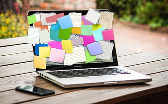
Laptop covered in colorful sticky notes on wooden table -
aesthetic:78
5888x3811px
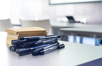
Stack of sticky notes and black pens on office desk -
aesthetic:82
5472x3648px
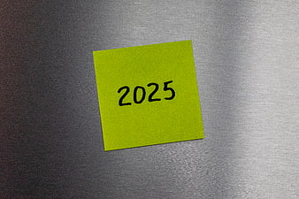
Yellow sticky note with 2025 on metal background -
aesthetic:82
3696x2448px
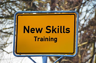
Yellow road sign reading New Skills Training -
aesthetic:78
4862x3249px
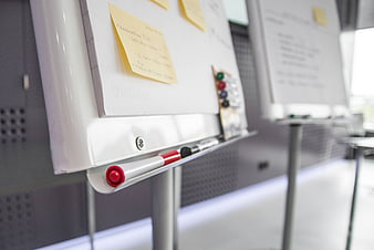
Close-up of whiteboard with sticky notes and markers in office -
aesthetic:82
5456x3632px
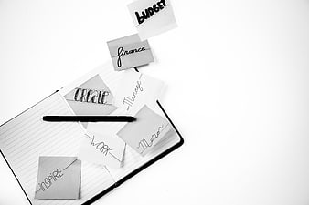
Black and white notebook with sticky notes and pen -
aesthetic:82
5888x3811px
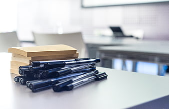
Stack of sticky notes and black pens on office desk -
aesthetic:76
4928x3264px
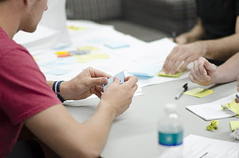
Team brainstorming with sticky notes in office meeting -
aesthetic:82
6000x4000px

Silhouette of man holding stack of books in library -
aesthetic:82
6000x4000px
Yellow sticky note with question mark and blue pen on white background -
aesthetic:78
4752x3168px

Business Planning Concept Chalkboard with Strategy Keywords and Lightbulb -
aesthetic:88
4961x3508px

Businesswoman touching skills concept on digital interface -
aesthetic:82
6000x4000px
Businessman with binary code head in library -
aesthetic:78
5472x3648px
100% Success Written in Chalk on Blackboard -
aesthetic:78
6000x4004px
Man drawing website wireframe on whiteboard -
aesthetic:72
6000x4287px

Blue coaching and training concept with person silhouette -
aesthetic:78
5472x3648px

Marketing strategy text written in chalk on a blackboard with arrow -
aesthetic:88
7360x4912px

Young woman pointing to empty white space -
aesthetic:72
4066x2734px

Businessman touching digital grid with success and knowledge text -
aesthetic:85
6000x2827px
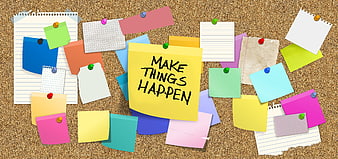
Cork board with colorful sticky notes and motivational quote -
aesthetic:82
6184x2927px
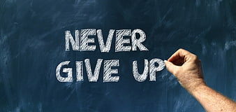
Hand writing never give up on a dark blue chalkboard with white chalk -
aesthetic:72
4752x3168px

White Chalk Magnifying Glass Drawing On Dark Blackboard Surface -
aesthetic:78
5939x3152px
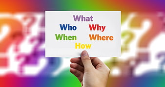
Hand holding card with question words against colorful background -
aesthetic:82
5120x3840px
Black and white notebook with glasses and pen on desk -
aesthetic:82
5391x4052px
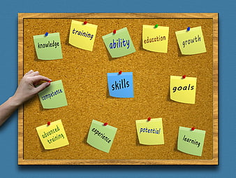
Corkboard with sticky notes for skills, training, and business goals -
aesthetic:84
3840x2160px
Laptop with colorful sticky notes bursting from screen -
aesthetic:82
3840x2160px
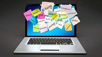
Laptop with sticky notes popping out of screen -
aesthetic:82
5016x3344px
Four colorful sticky notes arranged in a row on a white background -
aesthetic:85
3888x2592px
Close-up of a sharpened orange pencil on white paper -
aesthetic:78
5000x3000px
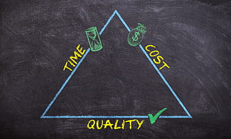
Project Management Triangle Diagram on Black Chalkboard -
aesthetic:85
4104x2736px
Black and white flat lay of creative workspace with smartphone and book -
aesthetic:85
4608x3456px
Pink Pens and Notebooks on White Desk with Copyspace -
aesthetic:72
5472x3648px
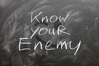
Know Your Enemy Chalk Text on Smudged Blackboard Background -
aesthetic:82
5184x3456px
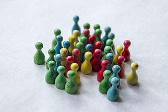
Colorful Wooden Human Figurines Grouped Together on White Surface -
aesthetic:78
1600x1067px
Solutions spelled with Scrabble tiles and sticky notes -
aesthetic:78
5600x3317px
Empty Chalk Tic Tac Toe Grid On Dark Textured Slate Background -
aesthetic:82
3888x2592px
Close-up of orange pencil tip on white paper -
aesthetic:82
4000x2400px
Top view of light bulb, pencils, and eraser on white paper -
aesthetic:65
6000x4000px

Young man with motivational text on white background -
aesthetic:78
5653x3880px
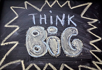
Handwritten Think Big Chalk Art On Black Chalkboard Background -
aesthetic:88
5184x3456px
Orange Leather Notebook on White Background -
aesthetic:82
6000x3278px
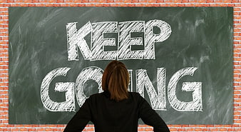
Woman looking at Keep Going written on chalkboard -
aesthetic:91
4608x3456px
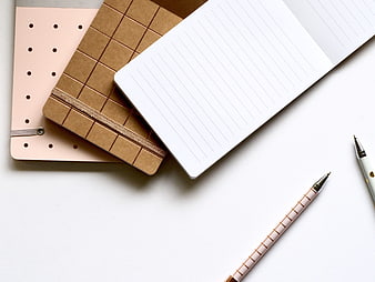
Minimalist flat lay of notebooks and pens on white background -
aesthetic:82
3010x2602px
Asian woman in beige coat writing on transparent board -
aesthetic:82
6000x3113px
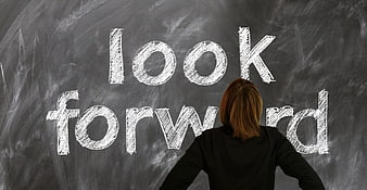
Woman looking at chalkboard with look forward written -
aesthetic:78
4200x3018px
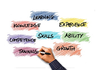
Hand writing training on whiteboard with skill development words -
aesthetic:82
4476x3357px
Black and white spiral notebook with pen on wooden desk -
aesthetic:90
5900x4000px
Colorful Pencils Arranged on Gray Background -
aesthetic:85
1536x2048px
Hand holding blank spiral notepad against teal background -
aesthetic:82
1536x2048px
Hand holding blank kraft paper spiral notepad -
aesthetic:88
3406x2274px
Black and white notebook with pen and ruler on desk -
aesthetic:82
1536x2048px
Hand holding brown spiral notebook against teal background -
aesthetic:78
5184x3456px
Colorful wooden game pieces on white background -
aesthetic:85
6016x4016px
Flat Lay of Crumpled Pink Paper and Pen on Yellow Background -
aesthetic:82
5269x3517px
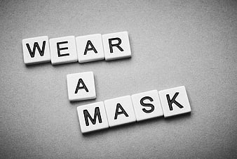
Wear a Mask Text on White Letter Tiles