
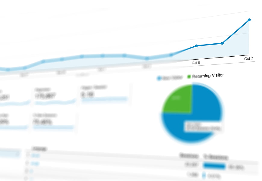
A blurred close-up of a digital analytics dashboard featuring a blue line graph showing upward growth and a pie chart. Ideal for data visualization, marketing statistics, and business reporting backgrounds.
Tags:
PHOTO INFO
- Image Size
- 5065x3500px
- File Size
- 216.41KB
- resolution
- 4K
- License
- Commercial use free
- Aesthetic Score
- 62/100
VISUAL ATTRIBUTES OF THIS STOCK PHOTO
- Color temperature
- cool
- Brightness
- high_key
- Saturation
- moderate
- Lighting Source
- studio
- Lighting Condition
- indoor
- Negative Space
- moderate
- Negative Space Location
- top_left
- Depth Of Field
- shallow
- Has People
- none
- Season
- unknown
- Time Of Day
- unknown
- Shot Scale
- close_up
- Background Type
- clean
- Orientation
- horizontal
- Composition Style
- diagonal
- Dominant colors
- bluegreenwhite
- Palette Style
- naturallight_airy
- Mood
- professionalhopeful
- Style
- corporatecommercial_advertising
- Subject type
- computerfinanceartificial_intelligence
ONLINE RESIZE
aesthetic analysis & score
The image serves as a competent, clean background asset for data-related topics, but the intentional blur limits its versatility and visual impact as a standalone piece.
Composition & Framing score
65The angled crop creates a dynamic diagonal flow that guides the eye toward the upward trend, though the tight framing cuts off context.
Lighting & exposure score
85The image is brightly lit with a clean, high-key white background that ensures the blue and green data elements pop clearly.
Color harmony & palette score
80The professional blue and green color scheme against white is standard for corporate data visualization and visually pleasing.
Visual impact & mood score
70The upward trajectory of the graph conveys a positive, professional mood of growth and success, despite the lack of sharpness.
Technical Quality & Clarity score
40The image is intentionally blurred, which significantly reduces technical sharpness and detail, limiting its use as a primary focal point.
Subject clarity & focal hierarchy score
50The focal point is the rising line graph, but the heavy blur obscures specific data points and labels, reducing informational clarity.
Use case suitability scores
Copyspace Layout Usability Score
90This image is suitable for text overlay layouts — the negative space in the top_left works for posters, banners, greeting cards and magazine covers needing headline room
Social Media Content Creation Score
75Web UI Digital Design Score
85This image is suitable for web UI and digital design projects — website hero sections, app splash screens, email headers, and UI mood boards
Commercial Advertising Branding Score
70Editorial Corporate Presentation Score
80Content Marketing Publishing Score
75Ecommerce Product Showcase Score
20Market Competitiveness Score
65Related Royalty free Photos
-
aesthetic:88
3000x2000px

Futuristic 3D Financial Growth Chart with Neon Glow -
aesthetic:65
5065x3500px
Blurred Analytics Dashboard with Blue and Green Charts -
aesthetic:72
4002x2668px
Tablet and printed reports showing website analytics dashboard on wooden desk -
aesthetic:82
8981x3667px

Woman with laptop and hand-drawn business growth charts -
aesthetic:76
5472x3648px
Laptop Screen Displaying Business Analytics and Growth Charts -
aesthetic:82
4288x2848px
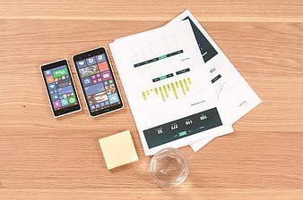
Business analytics report with smartphones on wooden desk -
aesthetic:72
5472x3648px

Laptop Keyboard and Blurred Business Chart on Desk -
aesthetic:78
4000x2670px
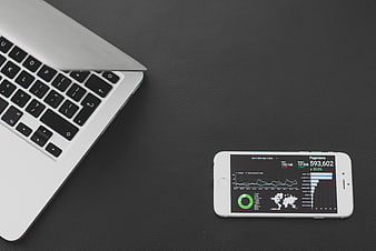
Laptop and smartphone displaying analytics dashboard on dark desk -
aesthetic:85
1920x1440px
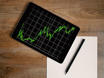
Tablet with green financial growth chart on wooden desk -
aesthetic:72
6144x4069px
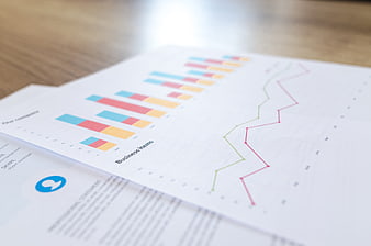
Close-up of financial business charts and graphs on paper -
aesthetic:72
4002x2668px
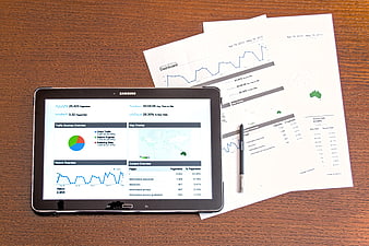
Tablet and printed analytics reports on wooden desk -
aesthetic:78
4000x2670px
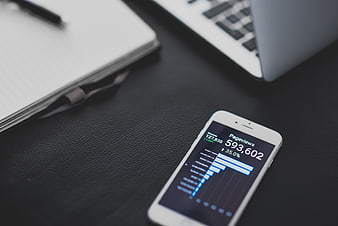
Smartphone displaying pageviews analytics on a dark desk -
aesthetic:72
4608x3456px
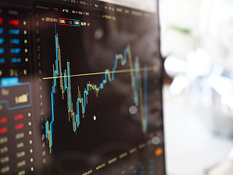
Close-up of financial stock market trading chart on computer screen -
aesthetic:82
6656x3744px

Young woman pointing at growth chart on blue background -
aesthetic:76
5774x3849px
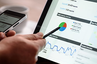
Hand Using Stylus on Tablet Analytics Dashboard -
aesthetic:78
5472x3648px

Laptop displaying web analytics dashboard in modern office -
aesthetic:78
5202x3468px
Laptop displaying analytics charts and graphs on screen -
aesthetic:72
5184x3456px
Laptop and tablet displaying business charts and calendar -
aesthetic:82
4288x2848px
Flat lay of business documents, smartphone, and office supplies on wooden desk -
aesthetic:76
5812x3875px
Financial Trading Charts on Computer Monitor Screen -
aesthetic:78
5472x3648px
Financial stock market chart on tablet screen -
aesthetic:75
4608x3456px
Stock Market Candlestick Chart on Computer Monitor -
aesthetic:82
4522x3015px

Smartphone displaying Google Analytics search results on mobile browser -
aesthetic:78
5472x3648px

Laptop displaying analytics dashboard on desk -
aesthetic:82
3000x2000px

Businesswoman holding whiteboard with innovation sketches and charts -
aesthetic:78
5120x3456px
Laptop displaying business charts and graphs on wooden desk -
aesthetic:72
1784x2304px
Business professionals analyzing financial data charts -
aesthetic:82
7066x4716px

Businesswoman pointing at financial growth charts and graphs -
aesthetic:85
3500x2333px
Red Stock Market Chart Showing Sharp Decline on Digital Screen -
aesthetic:87
3840x2160px

Abstract Digital Neural Network Data Visualization Background -
aesthetic:84
5202x3468px
Laptop displaying analytics dashboard with smartphone -
aesthetic:72
5391x3689px
Hand with pen analyzing financial charts and calculator -
aesthetic:78
1784x2304px
Business people reviewing statistical documents and charts -
aesthetic:78
5184x3456px
Laptop displaying business analytics dashboard on office desk -
aesthetic:76
3840x2160px

Abstract Digital Light Trails and Neon Lines Background -
aesthetic:75
5472x3648px
Financial Stock Market Chart on Digital Tablet Screen -
aesthetic:78
4499x2400px

Young man interacting with futuristic holographic technology interface -
aesthetic:72
5184x3456px
Laptop and tablet displaying business charts and calendar on desk -
aesthetic:82
6000x6000px

3D Man Pulling Green Slice from White Pie Chart -
aesthetic:75
5472x3648px

Man typing on laptop with analytics charts and coffee -
aesthetic:76
5801x3867px

Tablet and Coffee Cup on Modern Office Desk -
aesthetic:72
5472x3648px
Laptop Screen Showing Analytics Dashboard and Graphs -
aesthetic:78
3000x2000px

Abstract Blue Neural Network Connection Lines Background -
aesthetic:82
3702x2478px

Double Exposure AI Woman with Circuit Board and Code -
aesthetic:78
6000x4000px
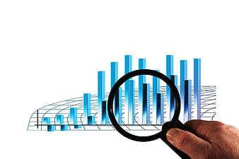
Hand holding magnifying glass over blue 3D bar chart -
aesthetic:78
5184x3456px
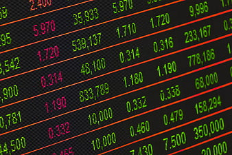
Close-up of digital stock market ticker board with financial data -
aesthetic:55
4523x2996px
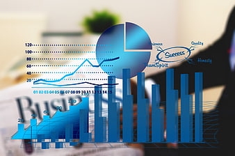
Blue Business Growth Charts and Success Diagram Overlay -
aesthetic:82
4288x2848px
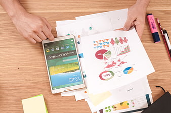
Businessman analyzing charts and infographics on wooden desk -
aesthetic:82
4365x2734px

Businessman touching digital interface icons on virtual screen -
aesthetic:80
6000x4000px
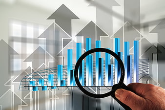
Hand holding magnifying glass over business growth chart -
aesthetic:78
6000x4000px
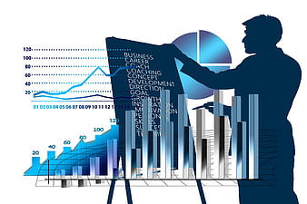
Business Growth Strategy Presentation with Charts and Silhouette -
aesthetic:85
4365x2734px

Businessman touching holographic world map network -
aesthetic:88
6000x3306px

Abstract Blue Digital Network Tunnel with Binary Code Sphere -
aesthetic:78
9000x3456px

Businesswoman analyzing blue financial charts and graphs -
aesthetic:80
5472x3648px
Scientific Calculator on Open Textbook with Graphs -
aesthetic:78
3000x2000px

Woman Typing on Laptop at Wooden Desk with Notebook -
aesthetic:88
6000x4000px

Abstract Artificial Intelligence Brain on Circuit Board Background -
aesthetic:72
3516x2811px
Hand holding magnifying glass over colorful 3D bar chart -
aesthetic:78
6144x4069px
Laptop displaying analytics dashboard on sofa -
aesthetic:82
6000x4000px

Blue Binary Code Tunnel Digital Data Visualization