
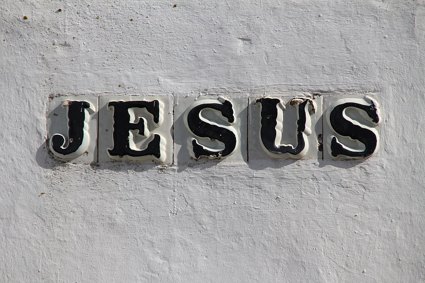
Close-up of black and white ceramic tiles spelling the name Jesus mounted on a rough white stucco wall. High contrast religious signage with vintage texture and natural lighting.
Tags:
PHOTO INFO
- Image Size
- 5184x3456px
- File Size
- 1.46MB
- resolution
- 5K
- License
- Commercial use free
- Aesthetic Score
- 78/100
VISUAL ATTRIBUTES OF THIS STOCK PHOTO
- Color temperature
- neutral
- Brightness
- high_key
- Saturation
- desaturated
- Lighting Source
- natural
- Lighting Condition
- midday
- Negative Space
- moderate
- Negative Space Location
- top, bottom
- Depth Of Field
- deep
- Has People
- none
- Season
- unknown
- Time Of Day
- afternoon
- Shot Scale
- close_up
- Background Type
- textured
- Orientation
- horizontal
- Composition Style
- centeredclose_up
- Dominant colors
- blackwhitegray
- Palette Style
- black_whitevintage
- Mood
- spiritualnostalgiccalm
- Style
- documentaryvintagereligious_cultural
- Subject type
- religioustext
ONLINE RESIZE
aesthetic analysis & score
The image is a strong, high-contrast composition that effectively uses texture and lighting to give depth to a simple subject, making it visually engaging and commercially versatile for religious or typographic themes.
Composition & Framing score
85The centered, horizontal alignment of the text creates a strong, balanced focal point with ample negative space above and below.
Lighting & exposure score
80Bright, natural sunlight casts distinct shadows that emphasize the three-dimensional relief of the ceramic letters.
Color harmony & palette score
75The stark black-and-white contrast against the textured white background is clean, legible, and visually striking.
Visual impact & mood score
70The weathered appearance of the tiles adds a sense of history and authenticity to the religious message.
Technical Quality & Clarity score
85The image is sharp with excellent detail in the rough texture of the wall and the worn edges of the ceramic tiles.
Subject clarity & focal hierarchy score
90The word 'JESUS' is the undeniable focal point, clearly separated from the background by high contrast and shadow.
Use case suitability scores
Copyspace Layout Usability Score
85This image is suitable for text overlay layouts — the negative space in the top, bottom works for posters, banners, greeting cards and magazine covers needing headline room
Social Media Content Creation Score
75Web UI Digital Design Score
70Commercial Advertising Branding Score
65Editorial Corporate Presentation Score
75Content Marketing Publishing Score
80Ecommerce Product Showcase Score
40Market Competitiveness Score
75Related Royalty free Photos
-
aesthetic:92
4608x3072px
Dramatic Black and White Statue of Jesus on the Cross -
aesthetic:82
4192x3052px
White textured plaster wall background with abstract paint strokes -
aesthetic:76
4256x2832px
Vintage Green Ceramic Tile Texture Background -
aesthetic:82
4863x3220px
Dramatic statue of Jesus Christ in Berlin Cathedral interior -
aesthetic:78
2500x5814px
Divine Mercy Jesus Painting with Rays of Light and Polish Text -
aesthetic:86
4020x2677px
Retro Style Ceramic Tile Mural with Stylized Figures -
aesthetic:85
4904x3456px
Black and white street art poster on brick wall -
aesthetic:78
4146x2765px
Aloha Text on Textured Concrete Wall Background -
aesthetic:85
4032x2264px

Vintage Neon Coffee Cup Sign in Warehouse -
aesthetic:82
5421x3614px

Dark Geometric 3D Triangle Pattern Texture Background -
aesthetic:84
4272x2848px

Vintage Neon Sign and Retro Telephones on Wall -
aesthetic:82
5291x3527px

Vintage One Way Street Sign on White Brick Wall -
aesthetic:85
6000x4000px

Vintage Red Neon Thank You Sign on Concrete Wall -
aesthetic:82
6160x10319px
Surreal Religious Art of Crucifixion with Floating Fish -
aesthetic:75
5710x3812px
Hello Beautiful Sign on Weathered Concrete Wall -
aesthetic:82
5867x3911px
Close-up of cracked blue and white ceramic tile pattern -
aesthetic:76
3456x2304px
Vintage Warning Sign on Textured Concrete Wall -
aesthetic:88
4367x2911px
Red neon sign with motivational quote on brick wall -
aesthetic:85
2999x2018px

Vintage Marquee Exit Sign with Light Bulbs -
aesthetic:82
4411x2940px
Close-up of weathered wooden Jesus crucifix statue -
aesthetic:72
1920x1280px
Textured Green and White Brick Wall Background -
aesthetic:78
3485x2333px
Simple black wooden cross on white wall background -
aesthetic:90
6000x4000px
Dramatic Wooden Cross Against Stormy Black and White Sky -
aesthetic:78
8192x5461px
Rusty Metal Bus Sign on Concrete Wall -
aesthetic:85
3089x2048px
Black and white graffiti mural of two women on house siding -
aesthetic:85
6000x4000px
Close-up of weathered wooden cross with rusty nails -
aesthetic:82
3804x5996px
Coffee Quote Poster on Textured Concrete Wall -
aesthetic:82
1920x1280px
Black and white textured concrete wall pattern -
aesthetic:88
4928x3264px

Colorful ceramic fish tile with floral mosaic pattern -
aesthetic:72
3533x2236px
Abstract Black and White Mosaic Tile Texture Background -
aesthetic:88
4000x2667px
Red Neon Home Cooking Sign in Dark Setting -
aesthetic:90
2272x1969px

Open Bible with glowing light and floating letters -
aesthetic:86
5184x3456px

White abstract religious statue of blessing on red background -
aesthetic:82
6000x4000px

White textured wall background with subtle plaster details -
aesthetic:88
4295x2552px

White Marble Statue of God the Father in Cathedral -
aesthetic:85
4000x3000px
Ancient Byzantine Mosaic of Christ Pantocrator in Hagia Sophia -
aesthetic:82
4000x2664px
Bronze Statue of Jesus Carrying the Cross in Forest -
aesthetic:82
6000x3376px
Vintage Route 71 Sign on Brick Wall -
aesthetic:90
3000x3688px

Traditional Orthodox Icon of Virgin Mary and Child Jesus -
aesthetic:78
5710x3812px
Hello Beautiful Sign on Weathered Concrete Wall -
aesthetic:78
1920x1280px
Vintage Holy Bible with aged leather cover and title page -
aesthetic:78
4898x3265px
Granite Statue of Jesus with Children in Garden -
aesthetic:82
2288x1712px
Bronze Statue of Jesus Christ with Crown of Thorns -
aesthetic:94
1552x1962px

Traditional Orthodox Icon of Mother of Perpetual Help Madonna and Child -
aesthetic:85
4272x2848px
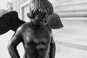
Black and white close-up of a bronze angel statue -
aesthetic:82
3264x2448px
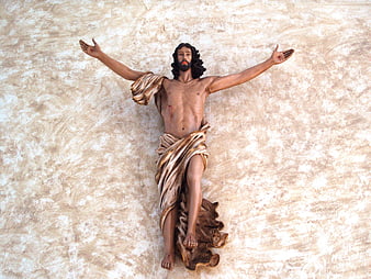
Statue of Jesus Christ on the Cross in Church -
aesthetic:85
6000x4000px

Retro Red Neon Thank You Sign on Concrete Wall -
aesthetic:88
5510x3559px
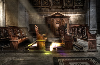
Sunbeams illuminating wooden pews in an empty cathedral interior -
aesthetic:88
4369x3389px
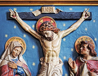
Religious Sculpture of Jesus Crucifixion with Mary and John -
aesthetic:82
3284x1847px
Dramatic Sepia Ocean Waves with Textured Water Surface -
aesthetic:88
3744x5616px
Silhouette of Jesus on Cross Against Golden Background -
aesthetic:82
7200x4800px
Vintage Drive-In Theatre Sign on Weathered Wall -
aesthetic:88
5761x3841px

Vintage black and white alarm clock on textured surface -
aesthetic:80
5184x3456px
Close-up of peeling black paint on a textured concrete wall -
aesthetic:85
5585x3744px
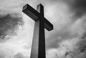
Black and white stone cross against dramatic cloudy sky -
aesthetic:88
2617x3501px
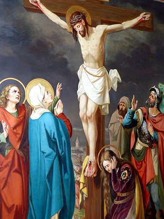
Classical painting of the crucifixion of Jesus with mourners -
aesthetic:91
4789x3592px
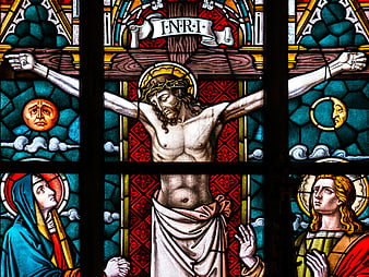
Stained Glass Window Depicting the Crucifixion of Jesus -
aesthetic:78
3264x1836px
French parking exit sign with car icon and arrow -
aesthetic:75
6016x4000px
White Rough Plaster Wall Texture Background -
aesthetic:86
3872x2592px
Vintage No 2 Sign on Red Textured Background