
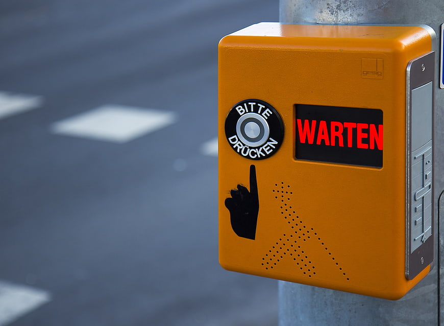
Close-up of an orange pedestrian crossing signal box displaying the German word 'WARTEN' in red LED lights. The device features a tactile button labeled 'BITTE DRÜCKEN' and a braille symbol for accessibility.
Tags:
PHOTO INFO
- Image Size
- 2000x1467px
- File Size
- 493.06KB
- resolution
- 1080P
- License
- Commercial use free
- Aesthetic Score
- 85/100
VISUAL ATTRIBUTES OF THIS STOCK PHOTO
- Color temperature
- neutral
- Brightness
- mid_tone
- Saturation
- vibrant
- Lighting Source
- natural
- Lighting Condition
- overcast
- Negative Space
- large
- Negative Space Location
- left
- Depth Of Field
- shallow
- Has People
- none
- Season
- unknown
- Time Of Day
- afternoon
- Shot Scale
- close_up
- Background Type
- blurred_bokeh
- Orientation
- horizontal
- Composition Style
- rule_of_thirds
- Dominant colors
- orangeredgrayblack
- Palette Style
- vibrant
- Mood
- professionalurban
- Style
- documentaryurban
- Subject type
- traffic signalurban infrastructure
ONLINE RESIZE
aesthetic analysis & score
This image is a high-quality, visually striking stock photo that effectively combines strong color contrast, sharp technical execution, and clear commercial utility for urban and accessibility themes.
Composition & Framing score
85The subject is placed on the right third, leaving ample negative space on the left for text or design elements.
Lighting & exposure score
90Even, natural lighting highlights the texture of the box and the brightness of the LED display without harsh shadows.
Color harmony & palette score
88The vibrant orange of the box contrasts sharply with the cool, muted blue-gray background, creating a visually striking composition.
Visual impact & mood score
80The bright red 'WARTEN' text and the bold orange color create a strong visual impact and a sense of urgency.
Technical Quality & Clarity score
92Sharp focus on the signal box with a smooth, pleasing bokeh in the background ensures high technical quality.
Subject clarity & focal hierarchy score
95The pedestrian signal box is the undisputed focal point, clearly separated from the background by depth of field.
Use case suitability scores
Copyspace Layout Usability Score
90This image is suitable for text overlay layouts — the negative space in the left works for posters, banners, greeting cards and magazine covers needing headline room
Social Media Content Creation Score
75Web UI Digital Design Score
85This image is suitable for web UI and digital design projects — website hero sections, app splash screens, email headers, and UI mood boards
Commercial Advertising Branding Score
80Editorial Corporate Presentation Score
85This image is suitable for editorial and corporate presentations — slide decks, annual reports, press releases, internal newsletters and conference presentation backgrounds
Content Marketing Publishing Score
80Ecommerce Product Showcase Score
40Market Competitiveness Score
85RELATED TAGS
Related Royalty free Photos
-
aesthetic:82
3216x2136px
Yellow Pedestrian Crossing Button on Metal Pole -
aesthetic:78
4200x2800px
Hand pressing pedestrian crossing button on yellow pole -
aesthetic:75
4067x2745px
Red Pedestrian Traffic Light Signal Close-Up -
aesthetic:78
2248x4000px
Blue Pedestrian Crossing Signal Button for Visually Impaired -
aesthetic:78
2248x4000px
Blue Pedestrian Crossing Signal Button for Visually Impaired -
aesthetic:85
4800x3200px
Green Pedestrian Traffic Light Signal Close-Up -
aesthetic:85
4460x2512px
Yellow Traffic Signal and Pedestrian Crossing Light Against Blue Sky -
aesthetic:74
3929x2210px
Crowd of Japanese pedestrians waiting at night crosswalk -
aesthetic:82
2248x4000px
Green pedestrian traffic light with walking man symbol -
aesthetic:88
4000x6000px
Green Pedestrian Traffic Light Signal with Running Man Icon -
aesthetic:82
2260x1932px
Yellow pedestrian crossing button on metal pole with blurred street background -
aesthetic:85
4000x2248px
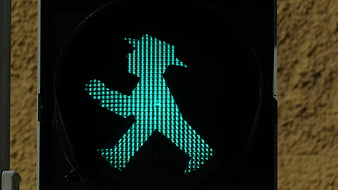
Close-up of green pedestrian traffic light signal -
aesthetic:85
4000x2248px
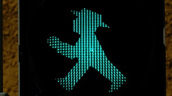
Close-up of illuminated green pedestrian traffic light signal -
aesthetic:75
5760x3688px
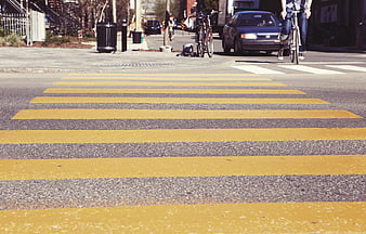
Low angle view of yellow striped crosswalk on city street -
aesthetic:85
3072x3139px
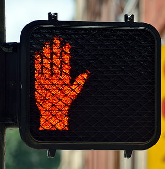
Close-up of red hand pedestrian stop signal -
aesthetic:78
3072x2048px
Close-up of Push Button Wait for Walk Signal on Street Pole -
aesthetic:85
4000x2248px
Red East German Ossi Ampelmännchen Pedestrian Traffic Light Signal -
aesthetic:84
4592x3448px
Vibrant Night Street Scene with Neon Lights and Traffic -
aesthetic:78
3456x5184px
Woman in Striped Shirt Waiting at Busy City Crosswalk -
aesthetic:85
6000x4000px
Aerial view of busy urban intersection with crosswalks and cars -
aesthetic:85
2248x4000px
Close-up of red East German Ossi traffic light pedestrian signal -
aesthetic:88
4201x2790px
Busy New York City Street with Yellow Taxis and Pedestrians -
aesthetic:78
3264x2448px
Urban Street Intersection with Crosswalk and City Buildings -
aesthetic:72
4366x3274px
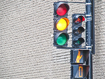
Urban Traffic Light Signal with Brick Wall Background -
aesthetic:88
4000x2248px
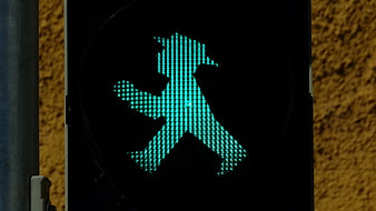
Green pedestrian traffic light with East German man silhouette -
aesthetic:82
5472x3648px
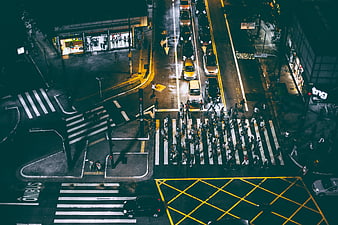
Aerial Night View of Busy Urban Intersection with Pedestrians -
aesthetic:72
2857x1465px
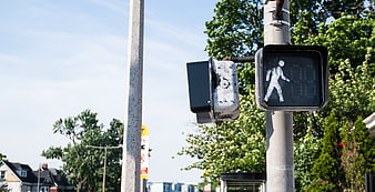
Pedestrian Crossing Signal with Walk Symbol on Urban Street -
aesthetic:85
3780x1998px
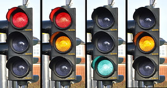
Sequence of traffic light signals showing red, amber, and green phases -
aesthetic:72
4608x3456px
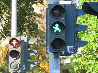
Berlin pedestrian traffic lights with red and green signals -
aesthetic:76
3000x4000px
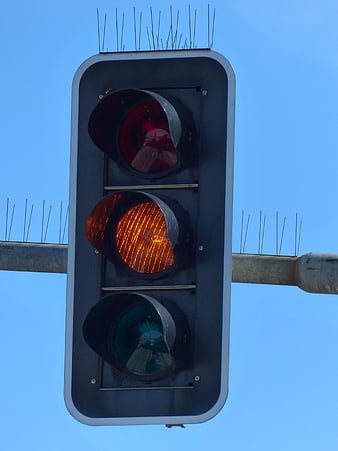
Close-up of traffic light with yellow signal illuminated against blue sky -
aesthetic:80
3508x4909px
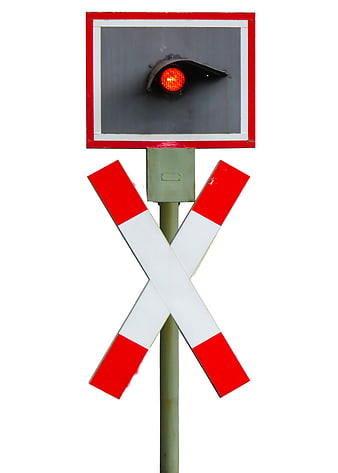
Railroad crossing signal with red light and crossbuck sign -
aesthetic:82
4000x2248px
Close-up of green East German pedestrian traffic light signal -
aesthetic:72
4326x1224px
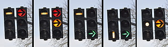
Sequence of traffic light signals showing red, yellow, and green phases -
aesthetic:74
1899x3043px
Pedestrians waiting at a busy city street corner -
aesthetic:90
2049x3074px
Close-up of illuminated red, yellow, and green traffic lights -
aesthetic:68
3563x2385px
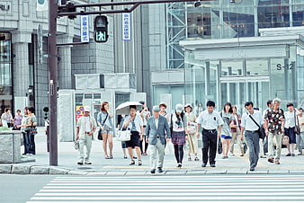
Crowd of pedestrians crossing street in modern Japanese city -
aesthetic:75
3430x2016px
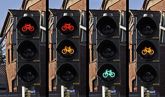
Sequence of bicycle traffic light signals showing red, amber, and green phases -
aesthetic:78
3000x4000px
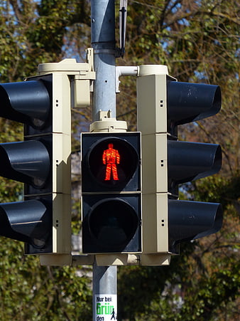
Red Pedestrian Traffic Light Signal Close Up -
aesthetic:72
5472x3648px
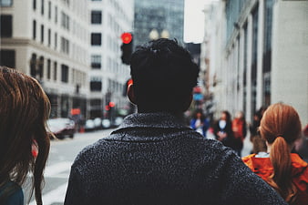
Back view of people waiting at city crosswalk -
aesthetic:72
3216x2136px
Close-up of Green Traffic Light Signal Against Sky -
aesthetic:85
2448x3264px
Green LED bicycle traffic signal at night -
aesthetic:82
2766x1788px
Triptych of Urban Pedestrian Traffic Signals Showing Red, Amber, and Green States -
aesthetic:78
3000x4000px
Red Pedestrian Traffic Light Signal Close Up -
aesthetic:82
5924x3950px
Times Square New York City Sunset with Crowds and Billboards -
aesthetic:78
2816x1912px
Composite of Traffic Light Signal Phases on Urban Street -
aesthetic:78
3780x1944px
Sequence of traffic light signals showing red, yellow, and green phases -
aesthetic:72
2448x3264px
Green pedestrian traffic light signal at night -
aesthetic:85
2448x3264px
Red LED bicycle traffic signal at night -
aesthetic:78
1819x2746px
Close-up of traffic light with green straight and right arrows -
aesthetic:78
2509x1673px
Construction workers and excavator at night on wet street -
aesthetic:85
2048x1356px
Night street scene in Osaka Japan with neon lights and pedestrians -
aesthetic:78
4672x3104px
Red Traffic Light Signal on Concrete Wall -
aesthetic:78
4496x3000px
Red Traffic Light Hanging Against Blue Sky with Clouds -
aesthetic:82
3000x4000px
Green Traffic Light Signal Against Blue Sky -
aesthetic:76
6000x4000px
Woman with Backpack Waiting at City Street Crossing -
aesthetic:78
5472x3648px
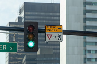
Green Traffic Light and Yield Sign in Urban Cityscape -
aesthetic:85
3296x1836px
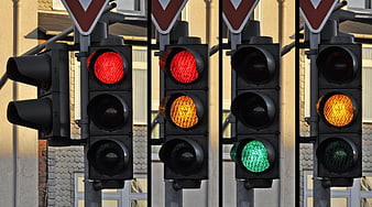
Composite of Traffic Light Signals Showing Red, Yellow, and Green -
aesthetic:88
5184x3456px
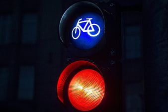
Close-up of bicycle traffic light with red signal at night -
aesthetic:82
3000x4000px
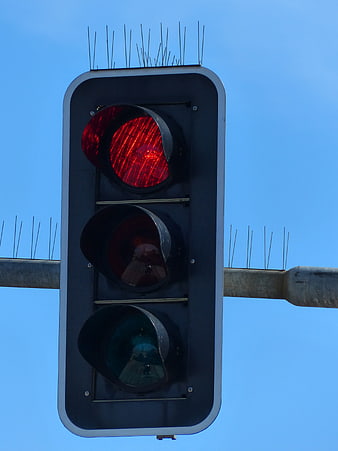
Red Traffic Light Signal Against Blue Sky -
aesthetic:80
4080x2720px
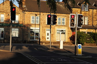
Red traffic lights on a sunny street corner with stone buildings