
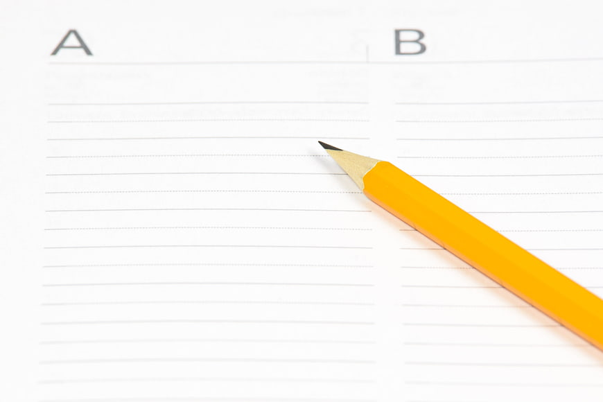
A close-up shot of a sharpened yellow pencil resting on a sheet of lined paper divided into two columns labeled A and B. This image represents decision making, planning, and choosing between alternatives.
Tags:
PHOTO INFO
- Image Size
- 5460x3640px
- File Size
- 263.09KB
- resolution
- 5K
- License
- Commercial use free
- Aesthetic Score
- 88/100
VISUAL ATTRIBUTES OF THIS STOCK PHOTO
- Color temperature
- neutral
- Brightness
- high_key
- Saturation
- moderate
- Lighting Source
- studio
- Lighting Condition
- indoor
- Negative Space
- large
- Negative Space Location
- top_left
- Depth Of Field
- shallow
- Has People
- none
- Season
- unknown
- Time Of Day
- unknown
- Shot Scale
- close_up
- Background Type
- clean
- Orientation
- horizontal
- Composition Style
- diagonal
- Dominant colors
- yellowwhitegray
- Palette Style
- natural
- Mood
- professionalcalm
- Style
- minimalistcorporate
- Subject type
- productoffice_scene
ONLINE RESIZE
aesthetic analysis & score
This image is a strong, clean, and effective representation of decision-making and planning, with excellent technical execution and a clear visual hierarchy.
Composition & Framing score
85The diagonal placement of the pencil creates a dynamic line that leads the eye across the frame, while the A and B headers provide a clear structural context.
Lighting & exposure score
90The lighting is bright and even, ensuring the paper is clean and white without harsh shadows or blown-out highlights.
Color harmony & palette score
88The vibrant yellow of the pencil contrasts beautifully with the neutral white and gray tones of the paper, creating a simple yet effective color scheme.
Visual impact & mood score
80The image conveys a sense of clarity and focus, effectively communicating the concept of making a choice or planning.
Technical Quality & Clarity score
92The image is sharp and clear, with excellent focus on the pencil tip and the text, while the background remains clean and uncluttered.
Subject clarity & focal hierarchy score
95The pencil is the clear focal point, drawing immediate attention, while the A and B labels provide essential context without distracting from the main subject.
Use case suitability scores
Copyspace Layout Usability Score
90This image is suitable for text overlay layouts — the negative space in the top_left works for posters, banners, greeting cards and magazine covers needing headline room
Social Media Content Creation Score
85This image is suitable for social media content creation — fits Instagram Stories, Pinterest pins, Facebook covers, LinkedIn backgrounds, and TikTok thumbnails
Web UI Digital Design Score
80Commercial Advertising Branding Score
75Editorial Corporate Presentation Score
90This image is suitable for editorial and corporate presentations — slide decks, annual reports, press releases, internal newsletters and conference presentation backgrounds
Content Marketing Publishing Score
85This image is suitable for content marketing and publishing — pairs with blog posts, article featured images, podcast covers, ebook covers and video thumbnails across publishing platforms
Ecommerce Product Showcase Score
60Market Competitiveness Score
85Related Royalty free Photos
-
aesthetic:82
7360x4912px
Field Notes Notebook and Pencil on Desk with Blurred Background -
aesthetic:70
4752x3168px
Open dotted notebook with yellow pencil on dark background -
aesthetic:78
5472x3648px
Close-up of silver pen on open notebook with laptop -
aesthetic:80
1430x955px
Flat lay of office supplies, laptop, and notebook on wooden desk -
aesthetic:82
4288x2848px
Open Blue Grid Notebook on Dark Surface -
aesthetic:85
6016x4016px
Flat lay of open notebook and green pencil on colorful background -
aesthetic:78
4460x2973px

Flat lay of workspace with coffee, pencils, and notebooks -
aesthetic:82
2738x1825px
Woman Writing in Planner with Green Pencil -
aesthetic:85
4608x3456px
Close-up of smartphone, pencil, and spiral notebook on white desk -
aesthetic:72
5184x3456px
Stationery on spiral notebook with marker and pencil -
aesthetic:82
4592x3448px
Silver fountain pen on lined notebook on wooden table -
aesthetic:86
4096x4096px
Open notebook with pencil and coffee on wooden desk -
aesthetic:78
6016x4000px
Black mechanical pencil on notebook with laptop background -
aesthetic:82
4928x3264px
Yellow Lined Paper on Clipboard with Pen -
aesthetic:78
5184x3456px
Open blank notebook with pencil on wooden desk -
aesthetic:72
3456x2304px
Black pen on open planner with July calendar and time slots -
aesthetic:84
5061x3376px
Vintage Notebook, Pen, and Glasses on Wooden Desk -
aesthetic:78
4608x3456px
Woman Writing in Notebook with Fountain Pen -
aesthetic:82
4608x3456px

Minimalist workspace with notebook, colored pencils, and glasses -
aesthetic:85
6000x3734px
Green pen and pencil on graph paper notebook -
aesthetic:85
6016x4016px
Colorful pencils and notepad on blue and green paper background -
aesthetic:85
6016x4016px
Composition notebook and green pencil on colorful background -
aesthetic:85
5616x3744px
Minimalist 2017 Planner, Pen, and Binder Clip on White Desk -
aesthetic:78
4340x2844px
Crumpled paper balls and pen on graph paper notebook -
aesthetic:85
4635x3090px
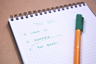
Handwritten to-do list on notebook with pen -
aesthetic:82
4365x2734px

Businessman Hand Writing Plan B on Transparent Screen -
aesthetic:85
6016x4016px
Close-up of fountain pen and ink bottle on notebook -
aesthetic:88
6000x4000px
Red Leather Notebook and Pencil on Desk -
aesthetic:80
4608x3456px
Blank Notebook and Pen on Wooden Desk with Laptop -
aesthetic:75
5941x3929px
Hands writing on yellow sticky notes at white office desk -
aesthetic:78
7952x5304px
Top View of Blank Spiral Notebook and Black Pen on Wood -
aesthetic:85
5606x3737px
Minimalist notebook and pen on textured gray background -
aesthetic:82
4517x3011px
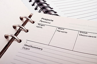
Close-up of bilingual project planning notebook page -
aesthetic:88
5016x3344px
Minimalist spiral notebook and pencils on white background -
aesthetic:85
3872x2592px
Minimalist black and green spiral notebooks with wooden pencil -
aesthetic:82
4928x3264px
Minimalist white notebook and pen on clean background -
aesthetic:80
2738x1825px
Woman Writing in Planner with Green Pencil -
aesthetic:85
4608x3456px
Minimalist white notebook and gold pens on white background -
aesthetic:85
5184x3456px
Gold and black pen on spiral notebook -
aesthetic:78
3456x2304px
Red Ballpoint Pen On Open Planner Schedule -
aesthetic:72
4752x3168px
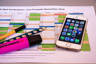
Marketing planning calendar with smartphone and stationery -
aesthetic:85
5472x3648px
Close-up of Green Cross Pattern on Textured Paper -
aesthetic:72
5472x3648px
Close-up of white paper with blue plus sign pattern -
aesthetic:78
4951x3224px
Green Pen On Grid Notebook Page With Blue Cover -
aesthetic:78
4000x2666px
Black pen pointing to circled date on German calendar -
aesthetic:82
3872x2592px
Blue crumpled paper ball on brainstorming sketch notebook -
aesthetic:82
5760x3840px

Woman holding orange notebook and pen on lap -
aesthetic:78
4608x3456px
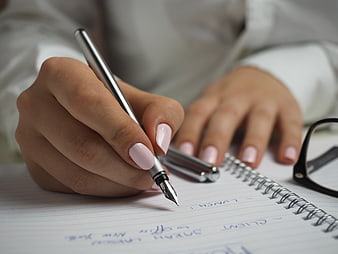
Close-up of woman writing in notebook with fountain pen -
aesthetic:91
4608x3456px
Minimalist flat lay of notebooks and pens on white background -
aesthetic:78
4862x3249px
Close-up of whiteboard with sticky notes and markers in office -
aesthetic:82
4928x3264px
Blank spiral notebook and pen on white background -
aesthetic:82
5016x3344px
Open Notebook with Blue and Black Pens on White Background -
aesthetic:85
4608x3456px
Pink Pens and Notebooks on White Desk with Copyspace -
aesthetic:82
6016x4016px
Colorful Flat Lay of Stationery and Crumpled Paper -
aesthetic:78
6000x4000px
Silver fountain pen on open blue notebook -
aesthetic:82
3000x1800px
Blank white paper and blue pencil on wooden table -
aesthetic:82
8064x5376px
Stack of blank sticky notes on gray background -
aesthetic:72
5016x3344px
Open Weekly Planner Notebook with Silver Pen on Desk -
aesthetic:82
5120x3840px
Black and white notebook with glasses and pen on desk -
aesthetic:85
4928x3264px
Floral Notebook and Pencil on Blue Background