
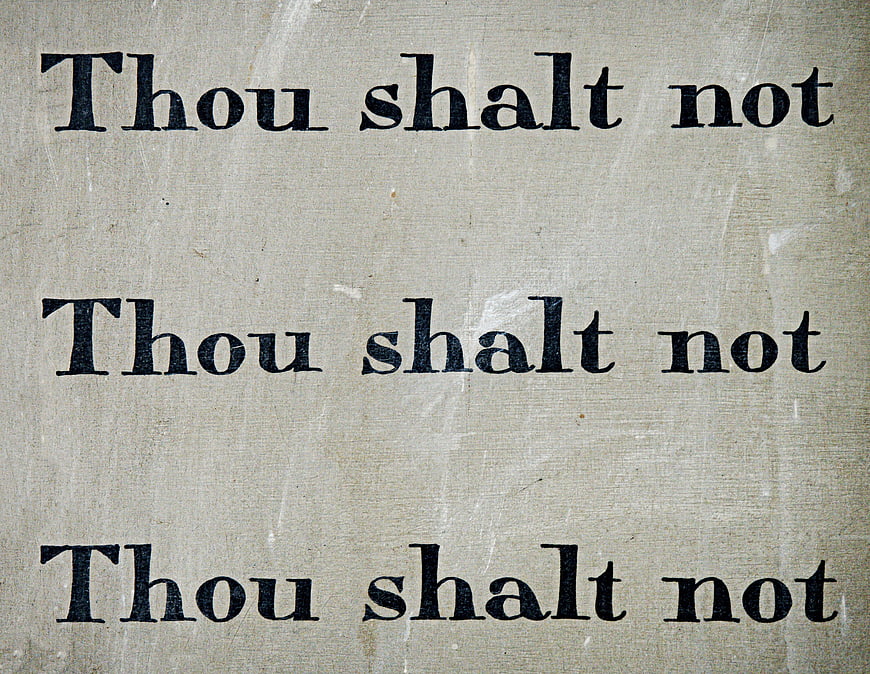
Close-up of the phrase 'Thou Shalt Not' printed in a classic serif font on textured, aged beige paper. The image features a vintage aesthetic with visible paper grain and wear, suitable for religious, legal, or prohibition-themed designs.
Tags:
- commandment
- thou
- shalt
- not
- law
- rule
- tablet
- ten
- moses
- bible
- old
- testament
- exodus
- deuteronomy
- prohibition
- legislation
- guilt
- negative
- stop
- prevent
- prevention
- font
- serif
- text
- word
- warning
- protect
- protection
- steal
- theft
- robbery
- murder
- evil
- dishonesty
- perjury
- covert
- envy
- religion
- doctrine
- danger
- secure
- security
- decalogue
- sinai
- covenant
- gray bible
- gray security
- gray law
- gray tablet
- gray evil
- gray stop
- thou shalt not
- vintage text
- aged paper
- serif font
- religious quote
- typography
- beige background
- old style
- textured surface
PHOTO INFO
- Image Size
- 4239x3286px
- File Size
- 2.87MB
- resolution
- 4K
- License
- Commercial use free
- Aesthetic Score
- 78/100
VISUAL ATTRIBUTES OF THIS STOCK PHOTO
- Color temperature
- warm_neutral
- Brightness
- mid_tone
- Saturation
- muted
- Lighting Source
- natural
- Lighting Condition
- indoor
- Negative Space
- small
- Negative Space Location
- surrounding
- Depth Of Field
- deep
- Has People
- none
- Season
- unknown
- Time Of Day
- unknown
- Shot Scale
- close_up
- Background Type
- textured
- Orientation
- horizontal
- Composition Style
- centered
- Dominant colors
- beigeblack
- Palette Style
- vintageearthy
- Mood
- seriousnostalgic
- Style
- vintagedocumentary
- Subject type
- textstill_life
ONLINE RESIZE
aesthetic analysis & score
This is a high-quality, clean scan of a vintage typographic element that effectively conveys a sense of authority and history through its texture and font choice. It is a strong, utilitarian asset for design projects requiring a classic or religious aesthetic.
Composition & Framing score
75The text is arranged in three distinct horizontal lines that fill the frame, creating a balanced and rhythmic visual structure.
Lighting & exposure score
80The lighting is even and flat, ensuring the text is clearly legible without harsh shadows or blown-out highlights on the paper texture.
Color harmony & palette score
85The high contrast between the dark ink and the warm, beige paper tones creates a classic, harmonious, and readable vintage palette.
Visual impact & mood score
70The repeated phrase and aged texture evoke a serious, authoritative, and historical mood, though the visual impact is somewhat static.
Technical Quality & Clarity score
90The image is sharp and high-resolution, clearly capturing the fine details of the paper grain and the edges of the serif typeface.
Subject clarity & focal hierarchy score
95The text is the sole subject and is immediately legible, establishing a clear and unambiguous focal hierarchy.
Use case suitability scores
Copyspace Layout Usability Score
40Social Media Content Creation Score
75Web UI Digital Design Score
60Commercial Advertising Branding Score
55Editorial Corporate Presentation Score
70Content Marketing Publishing Score
85This image is suitable for content marketing and publishing — pairs with blog posts, article featured images, podcast covers, ebook covers and video thumbnails across publishing platforms