
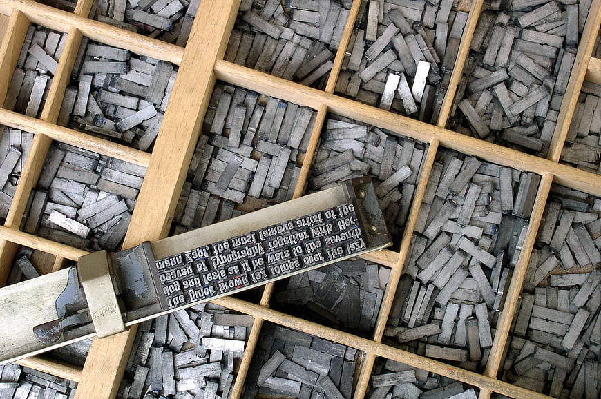
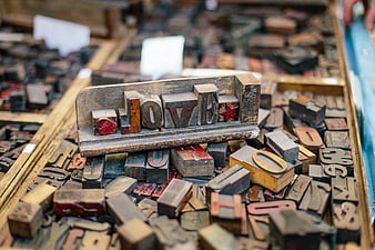
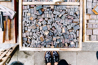
Top-down view of a wooden letterpress type case filled with scattered lead type and a composing stick holding a set line of text. This vintage typography image captures the essence of traditional printing and historical craftsmanship.
Tags:
PHOTO INFO
- Image Size
- 2288x1520px
- File Size
- 783.05KB
- resolution
- 1080P
- License
- Commercial use free
- Aesthetic Score
- 82/100
VISUAL ATTRIBUTES OF THIS STOCK PHOTO
- Color temperature
- neutral
- Brightness
- mid_tone
- Saturation
- muted
- Lighting Source
- studio
- Lighting Condition
- indoor
- Negative Space
- small
- Negative Space Location
- none
- Depth Of Field
- deep
- Has People
- none
- Season
- unknown
- Time Of Day
- unknown
- Shot Scale
- close_up
- Background Type
- textured
- Orientation
- horizontal
- Composition Style
- diagonalpattern
- Dominant colors
- graybrownblack
- Palette Style
- vintageearthy
- Mood
- nostalgicprofessional
- Style
- documentaryvintage
- Subject type
- typographyprintingantique
ONLINE RESIZE
aesthetic analysis & score
This image is a visually compelling and well-executed representation of vintage letterpress printing, with strong composition and clear subject matter that appeals to a niche but dedicated audience.
Composition & Framing score
85The diagonal placement of the composing stick creates a strong leading line that draws the eye across the grid of the type case.
Lighting & exposure score
80Even, diffused lighting highlights the textures of the metal and wood without creating harsh shadows or blown-out highlights.
Color harmony & palette score
75The muted tones of gray lead and natural wood create a cohesive, nostalgic palette that suits the vintage subject matter.
Visual impact & mood score
80The image evokes a strong sense of history and craftsmanship, appealing to those interested in traditional printing methods.
Technical Quality & Clarity score
85The image is sharp and detailed, clearly showing the individual letters and the wear on the metal type.
Subject clarity & focal hierarchy score
90The composing stick with the set text is the clear focal point, standing out against the background of loose type.
Use case suitability scores
Copyspace Layout Usability Score
40Social Media Content Creation Score
70Web UI Digital Design Score
60Commercial Advertising Branding Score
65Editorial Corporate Presentation Score
80Content Marketing Publishing Score
85This image is suitable for content marketing and publishing — pairs with blog posts, article featured images, podcast covers, ebook covers and video thumbnails across publishing platforms
Ecommerce Product Showcase Score
50Market Competitiveness Score
75Related Royalty free Photos
-
aesthetic:83
2288x1520px

Vintage Lead Type Blocks with German Text -
aesthetic:85
6000x4000px
Close-up of vintage wooden letterpress printing blocks -
aesthetic:82
7360x4912px
Close-up of wooden letters in a type case -
aesthetic:90
3500x2333px
Vintage Remington Standard Typewriter on Wooden Desk -
aesthetic:84
6000x4000px
Close-up of vintage wooden printing press letters and numbers -
aesthetic:82
4450x2954px

Vintage Royal Typewriter Keyboard Close-Up -
aesthetic:85
4547x3020px
Vintage wooden letterpress blocks in a drawer -
aesthetic:85
5258x3328px

Antique rusty keys on old handwritten crumpled paper -
aesthetic:78
4272x2848px

Vintage Polish Newspaper Page with Historical Headlines -
aesthetic:78
6000x4000px
Vintage metal letterpress printing blocks scattered close up -
aesthetic:80
4592x3056px
Vintage printing press workspace with old papers and tools -
aesthetic:78
3320x2032px
Close-up of vintage handwritten letter on aged paper -
aesthetic:84
5760x3840px
Vintage wooden letterpress blocks spelling love -
aesthetic:82
2232x1192px

Vintage metal lead type blocks with numbers 1, 2, and 3 -
aesthetic:84
5942x3932px

Close-up of vintage black typewriter with AZERTY keys -
aesthetic:88
2333x3500px

Vintage Remington Standard Typewriter with Blank Paper -
aesthetic:84
6000x4000px
Close-up of vintage typewriter keys on wooden desk -
aesthetic:82
3690x2268px
Close-up of antique German hymn book page with Fraktur text -
aesthetic:88
2500x1500px

Vintage Typewriter and Old Books on White Background -
aesthetic:85
6260x4374px

Hands typing on vintage black typewriter -
aesthetic:85
6016x4016px

Close-up of vintage typewriter keys in black and white -
aesthetic:82
5946x3969px

Close-up of vintage typewriter keys and mechanism -
aesthetic:78
3710x2802px
Close-up of antique German text on aged book pages -
aesthetic:85
4000x6000px
Rusty Metal Letter A Cutout on Weathered Steel Plate -
aesthetic:85
4752x3168px
Close-up of vintage Sütterlin handwriting on aged paper -
aesthetic:84
4608x3456px

Vintage Glasses on Open Map Atlas Book -
aesthetic:85
6016x4016px

Close-up of vintage typewriter keys in black and white -
aesthetic:82
3775x5222px
Vintage 1925 German Newspaper Front Page -
aesthetic:82
4000x2667px
Open antique leather-bound book with historical text on wooden table -
aesthetic:82
5942x3932px

Close-up of vintage black typewriter keys and typebars -
aesthetic:82
5184x3456px

Close-up of vintage typewriter keys with shallow depth of field -
aesthetic:88
4608x3072px

Vintage Royal Typewriter On Rustic Wooden Plank Background -
aesthetic:86
5184x3456px

Vintage wax seal on envelope with wooden stamp -
aesthetic:85
6000x4000px

Stack of vintage books with open pages on wooden table -
aesthetic:85
6000x4000px

Stack of vintage hardcover books with gold embossed spines -
aesthetic:78
1062x708px
Vintage Letterpress Printing Blocks with German Text -
aesthetic:82
1062x708px

Vintage Letterpress Printing Press with Metal Type -
aesthetic:84
1062x708px
Vintage Wooden Letterpress Blocks Spelling Made in Vietnam -
aesthetic:78
1062x708px
Vintage Wooden Letterpress Blocks and Printing Tools -
aesthetic:82
1062x708px
Vintage wooden letterpress blocks in a crate -
aesthetic:80
1062x708px
Vintage Printing Press Desk with Old Tools and Paper