
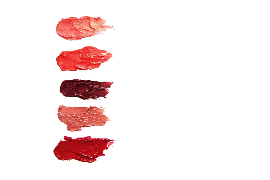
Vertical arrangement of five creamy lipstick swatches in shades of coral, bright red, burgundy, nude, and crimson on a clean white background. Ideal for beauty branding, cosmetic color charts, and makeup editorial layouts with ample copyspace.
Tags:
PHOTO INFO
- Image Size
- 6480x4320px
- File Size
- 616.96KB
- resolution
- 5K
- License
- Commercial use free
- Aesthetic Score
- 70/100
VISUAL ATTRIBUTES OF THIS STOCK PHOTO
- Color temperature
- neutral
- Brightness
- high_key
- Saturation
- vibrant
- Lighting Source
- studio
- Lighting Condition
- indoor
- Negative Space
- large
- Negative Space Location
- right
- Depth Of Field
- deep
- Has People
- none
- Season
- unknown
- Time Of Day
- unknown
- Shot Scale
- close_up
- Background Type
- solid_color
- Orientation
- horizontal
- Composition Style
- minimal
- Dominant colors
- redpinkwhite
- Palette Style
- vibrant
- Mood
- professionalcalm
- Style
- product_photographyminimalist
- Subject type
- cosmetics
ONLINE RESIZE
aesthetic analysis & score
A well-executed, commercially functional cosmetic swatch image whose clean layout and accurate color rendering make it highly usable, though its plain presentation keeps it from standing out as memorable.
Composition & Framing score
75The vertical alignment of swatches on the left creates a clean, organized layout with deliberate negative space on the right.
Lighting & exposure score
80Even, shadow-free studio lighting accurately renders the pigment and texture of each swatch without hotspots.
Color harmony & palette score
78The progression from coral to crimson against a pure white field is harmonious and true to the cosmetic subject.
Visual impact & mood score
65The presentation is professional and clean but visually restrained, lacking a strong emotional hook beyond utility.
Technical Quality & Clarity score
82Sharp focus captures the creamy, textured drag of each swatch with crisp edges and no visible noise.
Subject clarity & focal hierarchy score
85Each swatch is clearly separated and legible, making the color range the unambiguous focal point.
Use case suitability scores
Copyspace Layout Usability Score
90This image is suitable for text overlay layouts — the negative space in the right works for posters, banners, greeting cards and magazine covers needing headline room
Social Media Content Creation Score
65Web UI Digital Design Score
75Commercial Advertising Branding Score
78Editorial Corporate Presentation Score
70Content Marketing Publishing Score
75Ecommerce Product Showcase Score
80Market Competitiveness Score
65Related Royalty free Photos
-
aesthetic:88
6480x4320px
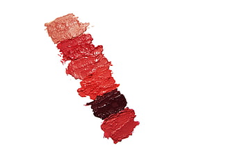
Red Lipstick Swatches on White Background -
aesthetic:88
4460x2973px
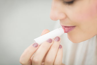
Woman applying lip balm close-up with manicured nails -
aesthetic:86
5472x3648px
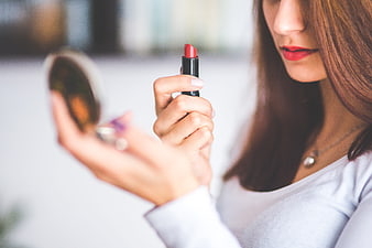
Woman applying red lipstick while looking in a mirror -
aesthetic:87
5472x3648px
Pink Blush Compact and Makeup Brush on White Surface -
aesthetic:85
4088x2725px
Close-up of makeup artist applying lipstick to woman's face -
aesthetic:84
5026x3351px
Lip gloss, coffee cup, and magazine on white wooden table -
aesthetic:90
5760x3840px
Woman applying lip balm on white background -
aesthetic:85
5472x3648px
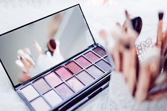
Pink eyeshadow palette with makeup brushes on white background -
aesthetic:81
5184x3888px
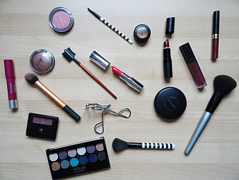
Flat Lay Collection Of Beauty Products And Brushes On Wood -
aesthetic:88
4608x3456px
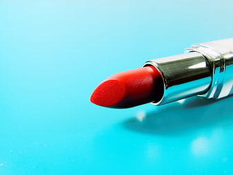
Close-up of red lipstick on bright blue background -
aesthetic:85
5283x3325px
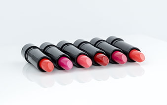
Row of colorful lipsticks on white background -
aesthetic:85
3002x1772px
Flat lay of makeup brushes, palette, and eyelash curler on white -
aesthetic:86
4484x3280px
Close-up of woman applying lipstick with tooth gem -
aesthetic:85
4460x2973px
Woman applying pink lip balm close up -
aesthetic:82
5184x3456px
Close-up of a woman with eyes closed and lips parted -
aesthetic:82
3210x2140px
Flat lay of makeup brushes, eyeshadow palette, and eyelash curler on white background -
aesthetic:86
6000x4000px
Flat lay of makeup, notebook, and glasses on pink background -
aesthetic:88
4460x2973px
Woman applying lip balm close-up with copyspace -
aesthetic:82
5472x3648px
Neutral Eyeshadow Palette with Makeup Brushes on White Background -
aesthetic:78
3240x3240px
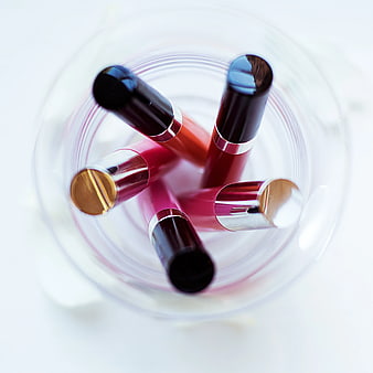
Top View of Assorted Liquid Lipsticks in Glass Jar -
aesthetic:88
3021x2351px
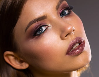
Close-up portrait of woman with glamorous purple makeup -
aesthetic:85
3456x5184px
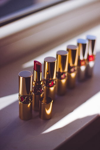
Luxury Gold Lipstick Collection in Sunlight -
aesthetic:85
5591x3727px
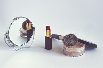
Red lipstick, makeup brush, and powder on white background -
aesthetic:85
3456x5184px
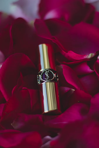
Luxury Gold Lipstick on Red Rose Petals -
aesthetic:82
5184x3456px
Close-up portrait of a woman with eyes closed and serene expression -
aesthetic:85
3872x2592px
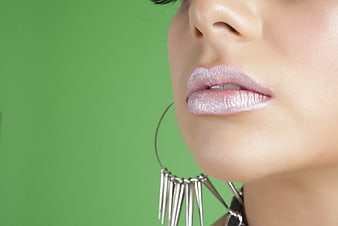
Close-up of Woman's Lips with Glittery Makeup and Silver Earrings -
aesthetic:88
6000x3376px
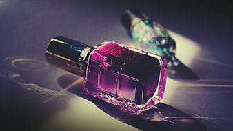
Pink and Blue Nail Polish Bottles on Dark Surface -
aesthetic:93
3525x4810px
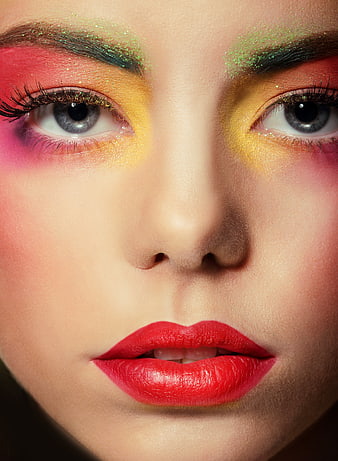
Close-up of Woman with Vibrant Multicolor Glitter Makeup -
aesthetic:85
4968x3004px
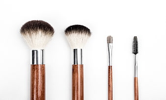
Set of wooden makeup brushes on white background -
aesthetic:85
5472x3648px
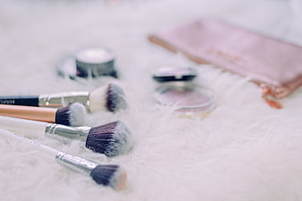
Makeup Brushes and Cosmetics on White Fur Background -
aesthetic:88
3648x5157px
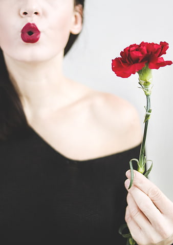
Woman Blowing Kiss with Red Carnation -
aesthetic:85
4752x3168px
Makeup artist applying lipstick to blonde model with purple eyeshadow -
aesthetic:86
3744x3744px
Colorful makeup pouch with brushes on white background -
aesthetic:89
5120x3413px
Portrait of Young Woman with Curly Hair in Blue Sweater -
aesthetic:76
5472x3648px
Collection of black lipstick tubes on white fur background -
aesthetic:74
5813x3270px
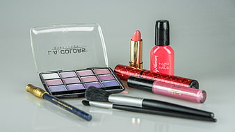
Collection of cosmetics including eyeshadow palette, lipstick, and nail polish -
aesthetic:82
3840x2560px
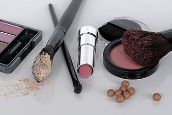
Flat lay of makeup brushes, lipstick, and powder on white background -
aesthetic:82
5472x3648px
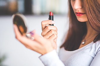
Woman applying red lipstick while looking in a compact mirror -
aesthetic:88
6000x4000px
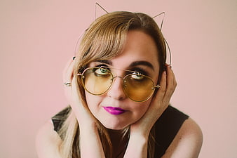
Woman with Cat Ear Headphones and Yellow Sunglasses -
aesthetic:85
4000x6016px
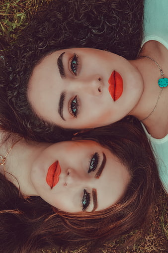
Close-up portrait of two women with red lipstick lying on grass -
aesthetic:75
5472x3648px
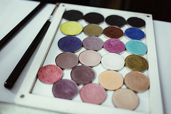
Colorful makeup palette with brushes on white background -
aesthetic:88
5408x3605px
Woman holding pink lip balm close-up -
aesthetic:85
3002x1772px
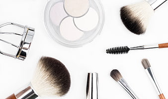
Flat lay of makeup brushes, eyeshadow palette, and eyelash curler on white background -
aesthetic:88
4256x2832px
Close-up portrait of smiling woman looking up upside down -
aesthetic:83
2705x3825px
Blonde Woman Applying Lipstick With Mirror And Sunglasses -
aesthetic:85
6000x4000px
Flat lay of colorful makeup products and brushes on white background -
aesthetic:92
5433x3698px
Beautiful Woman with Red Lips and Smooth Skin on White -
aesthetic:82
4752x3168px
Portrait of Brunette Woman with Red Lipstick Against White Wall -
aesthetic:72
6016x4016px
Colorful Lipstick Collection on Retail Display Shelf -
aesthetic:88
12000x7050px
Rainbow colored lipsticks in silver tubes on white background -
aesthetic:84
5120x2880px
Portrait of young woman with curly hair in nature -
aesthetic:85
5472x3648px
Makeup artist applying colorful eyeshadow palette -
aesthetic:88
4605x3697px
Woman with purple glitter mask makeup and pink lips -
aesthetic:90
2851x3408px
Close-up portrait of woman with red makeup and nail polish -
aesthetic:85
5472x3648px

Close-up of makeup brushes on white surface -
aesthetic:90
5616x3744px
Close-up of woman laughing with red lipstick and gold earrings -
aesthetic:88
5770x2095px
Close-up of glossy pink lips on fair skin -
aesthetic:82
3547x2265px
MAC Eyeshadow Palette And Loose Powder On White Background -
aesthetic:75
4752x3168px
Close-up portrait of woman exhaling smoke with dramatic makeup -
aesthetic:76
3000x1927px
Flat Lay of Lip Gloss Set, Glasses, and Accessories on Burlap