
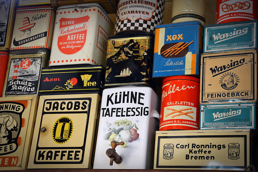
A nostalgic collection of vintage German tin boxes stacked on shelves, featuring classic brands like Jacobs Kaffee, Kuhne Tafelessig, and Warsing. The colorful retro packaging offers a rich texture of mid-century advertising design.
Tags:
PHOTO INFO
- Image Size
- 6000x4000px
- File Size
- 1.52MB
- resolution
- 5K
- License
- Commercial use free
- Aesthetic Score
- 84/100
VISUAL ATTRIBUTES OF THIS STOCK PHOTO
- Color temperature
- warm_neutral
- Brightness
- mid_tone
- Saturation
- moderate
- Lighting Source
- indoor
- Lighting Condition
- indoor
- Negative Space
- none
- Negative Space Location
- none
- Depth Of Field
- deep
- Has People
- none
- Season
- unknown
- Time Of Day
- unknown
- Shot Scale
- close_up
- Background Type
- complex
- Orientation
- horizontal
- Composition Style
- patternclose_up
- Dominant colors
- redblueyellowwhiteblackbrown
- Palette Style
- vintagevibrant
- Mood
- nostalgiccheerful
- Style
- vintagestill_life
- Subject type
- productstill_life
ONLINE RESIZE
aesthetic analysis & score
This image is a visually rich and well-executed display of vintage packaging, offering strong commercial appeal for design, history, and lifestyle contexts due to its authentic texture and nostalgic charm.
Composition & Framing score
85The tight, grid-like framing effectively fills the frame with texture and detail, creating a satisfying pattern of vintage packaging.
Lighting & exposure score
80Even, diffused lighting illuminates the various surfaces without harsh shadows, allowing the text and illustrations on the tins to remain legible.
Color harmony & palette score
88The diverse array of retro colors—reds, blues, yellows, and creams—creates a vibrant and harmonious mosaic typical of mid-century design.
Visual impact & mood score
85The image evokes a strong sense of nostalgia and curiosity, appealing to collectors and design enthusiasts through its authentic vintage aesthetic.
Technical Quality & Clarity score
82The image is sharp and detailed, capturing the wear, texture, and typography of the tins with high fidelity.
Subject clarity & focal hierarchy score
80While the image is busy, the distinct branding and varied shapes of the tins create a clear visual hierarchy that guides the eye across the collection.
Use case suitability scores
Copyspace Layout Usability Score
20Social Media Content Creation Score
75Web UI Digital Design Score
60Commercial Advertising Branding Score
70Editorial Corporate Presentation Score
65Content Marketing Publishing Score
80Ecommerce Product Showcase Score
40Market Competitiveness Score
75RELATED TAGS
Related Royalty free Photos
-
aesthetic:84
3920x2645px
Collection of vintage radios on wooden shelves -
aesthetic:86
5400x3566px

Vintage tin boxes with retro labels and colorful designs -
aesthetic:88
3264x2176px
Vintage black and white photographs in an old wooden box -
aesthetic:85
5472x3648px
Vintage Retro Radio Collection with Shallow Depth of Field -
aesthetic:85
3868x2579px
Vintage Typewriter with Clock Detail -
aesthetic:78
4288x2848px

Vintage vinyl record collection in a dimly lit shop -
aesthetic:84
5512x3675px
Vintage Kodak Brownie Flash B Camera Held in Hand -
aesthetic:78
4608x3456px
Vintage Omega Pocket Watch on Old Paper -
aesthetic:85
3000x2000px

Close-up of antique books on a wooden shelf -
aesthetic:85
4547x3020px
Vintage Sepia Photographs in Antique Card Catalog -
aesthetic:85
5340x3588px
Vintage Cameras and Film Reels on a Shelf -
aesthetic:86
4664x3105px

Vintage Typewriter Close-Up in Black and White -
aesthetic:84
3840x2160px
Vintage Rusty Camera on Wooden Table with Old Photographs -
aesthetic:84
3200x1803px
Close-up of vintage rotary telephone dial with warm lighting -
aesthetic:85
2469x1646px
Vintage Canned Food Shelves in Retro Supermarket -
aesthetic:82
4641x3094px
Three vintage folding cameras on beige background -
aesthetic:85
3000x2000px
Vintage handwritten letters on aged paper with shallow depth of field -
aesthetic:72
5647x3770px
Vintage cigar bands in yellow tin box -
aesthetic:82
5213x3580px
Vintage Cinema Sign on Old European Building Facade -
aesthetic:85
2445x3490px
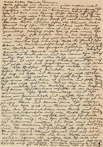
Vintage German Sütterlin Handwriting on Aged Paper -
aesthetic:84
4093x2711px
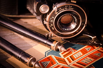
Vintage Agfa Anastigmat Camera and Film Labels on Wooden Table -
aesthetic:85
3000x2000px

Vintage antique books on a wooden shelf close up -
aesthetic:85
4928x3264px
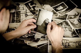
Hands holding vintage black and white photograph over scattered memories -
aesthetic:85
7952x5304px
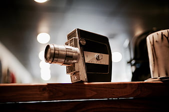
Vintage Keystone Movie Camera on Wooden Shelf -
aesthetic:82
3000x2002px
Vintage Sharp Television Set on Stand Against Wall -
aesthetic:84
4000x2657px

Vintage Italian Books Stacked in Columns -
aesthetic:76
5000x3333px
Vintage Quebec License Plates Displayed in Shop Window -
aesthetic:84
5616x3744px
Close-up of vintage Kodak Brownie camera -
aesthetic:85
3893x2717px
Vintage Antique Books on Shelf with Ornate Spines -
aesthetic:82
3000x2002px
Vintage Retro Television Set on Stand Against Wall -
aesthetic:85
6144x4096px
Vintage Rustic Tin Signs on Weathered Wooden Barn Wall -
aesthetic:84
3920x2645px
Vintage Retro Radios on Wooden Shelves Collection -
aesthetic:78
3303x2121px
Vintage German Postcard Address Side With 1899 Postmark -
aesthetic:78
6000x4000px
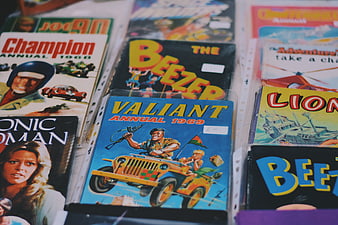
Vintage British Comic Annuals and Books on Display -
aesthetic:86
4608x3456px
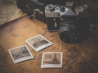
Vintage Zenit Camera and Paris Postcards on Old Map -
aesthetic:82
3190x4816px
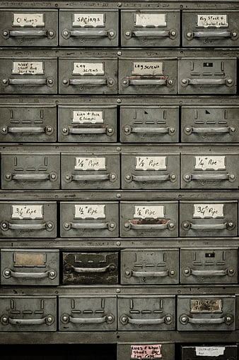
Vintage Metal Hardware Cabinet with Handwritten Labels -
aesthetic:82
4000x3000px
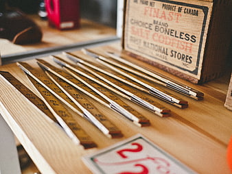
Vintage wooden rulers and antique codfish crate on table -
aesthetic:85
4272x2848px
Vintage orange hotel sign against blue sky -
aesthetic:84
4429x2542px

Vintage leather-bound books on a wooden shelf -
aesthetic:86
2878x2117px
Vintage Blue Toy Car on Wooden Shelf -
aesthetic:85
4896x3264px
Vintage Rusty Kitchen Scale on Wooden Shelf -
aesthetic:85
6000x4000px

Stack of vintage antique books on wooden table -
aesthetic:78
3389x2259px
Antique Tin Storage Box With Ornate Engraved Floral Design -
aesthetic:84
3920x2645px
Collection of vintage radios on wooden shelves -
aesthetic:85
4928x3264px

Vintage open photo album with scattered black and white memories -
aesthetic:85
4000x2839px
Vintage black sewing machine with gold details on wooden box -
aesthetic:85
6000x4000px
Vintage fountain pen on handwritten letter with white flower petals -
aesthetic:85
4928x3264px
Vintage Boy Box Camera with Old Photos in Snow -
aesthetic:84
4928x3264px
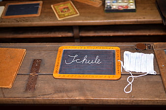
Vintage wooden school desk with slate blackboard and knitting -
aesthetic:84
5454x3068px
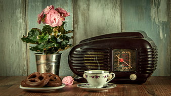
Vintage Radio, Coffee Cup, and Pretzels Still Life -
aesthetic:88
4256x2394px

Vintage Typewriter and Lamp on Wooden Desk -
aesthetic:85
3888x2592px
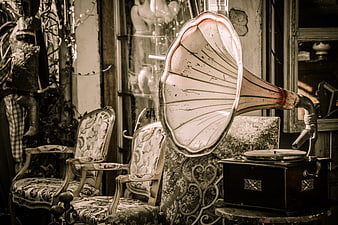
Vintage Gramophone in Antique Shop Interior -
aesthetic:76
4608x3456px
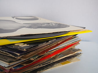
Stack of vintage vinyl records with worn sleeves -
aesthetic:86
6000x4000px
Vintage Letter with Magnolia Flower and Fountain Pen -
aesthetic:88
4213x2904px
Vintage Coca-Cola Advertising Sign with Ornate Typography -
aesthetic:86
6000x4000px
Vintage fountain pen and white tulip on handwritten letter -
aesthetic:88
4404x2477px
Vintage black rotary telephone in red wooden phone booth -
aesthetic:86
2048x1536px

Vintage leather-bound books on wooden library shelves -
aesthetic:85
3089x2048px
Three vintage payphones on a bright yellow wall -
aesthetic:78
2560x1920px
Vintage Red Coca-Cola Cooler with Glass Bottles