
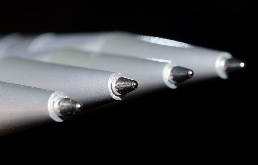
Detailed macro photography of four silver ballpoint pen tips arranged diagonally against a stark black background. High-contrast image highlighting the metallic texture and precision of the writing instruments.
Tags:
PHOTO INFO
- Image Size
- 4311x2761px
- File Size
- 667.4KB
- resolution
- 4K
- License
- Commercial use free
- Aesthetic Score
- 78/100
VISUAL ATTRIBUTES OF THIS STOCK PHOTO
- Color temperature
- cool
- Brightness
- low_key
- Saturation
- desaturated
- Lighting Source
- studio
- Lighting Condition
- indoor
- Negative Space
- large
- Negative Space Location
- bottom_right
- Depth Of Field
- shallow
- Has People
- none
- Season
- unknown
- Time Of Day
- unknown
- Shot Scale
- macro
- Background Type
- solid_color
- Orientation
- horizontal
- Composition Style
- diagonalclose_up
- Dominant colors
- graysilverblack
- Palette Style
- monochromedark_moody
- Mood
- professionalminimalist
- Style
- product_photographymacro
- Subject type
- product
ONLINE RESIZE
aesthetic analysis & score
This is a technically proficient macro shot with excellent focus and composition, though the subject matter is common and limits its overall visual distinctiveness.
Composition & Framing score
85The strong diagonal arrangement of the pen tips creates a dynamic leading line that draws the eye through the frame effectively.
Lighting & exposure score
80High-contrast lighting accentuates the metallic texture and spherical tips while maintaining a deep, clean black background.
Color harmony & palette score
75The monochromatic silver and gray tones against the black background create a sleek, industrial, and unified color scheme.
Visual impact & mood score
70The image conveys a sense of precision and minimalism, though the subject matter is somewhat utilitarian and lacks strong emotional resonance.
Technical Quality & Clarity score
88The macro focus is sharp on the nearest pen tip, revealing fine details of the metal ball and casing with excellent clarity.
Subject clarity & focal hierarchy score
90The shallow depth of field clearly establishes the front pen tip as the primary focal point, with the others receding naturally into the background.
Use case suitability scores
Copyspace Layout Usability Score
85This image is suitable for text overlay layouts — the negative space in the bottom_right works for posters, banners, greeting cards and magazine covers needing headline room
Social Media Content Creation Score
60Web UI Digital Design Score
75Commercial Advertising Branding Score
70Editorial Corporate Presentation Score
80Content Marketing Publishing Score
75Ecommerce Product Showcase Score
65Market Competitiveness Score
72Related Royalty free Photos
-
aesthetic:82
4592x3448px
Close-up of fountain pen on handwritten notebook -
aesthetic:82
5184x3456px
Top View of Colorful Pens and Markers in Metal Cup -
aesthetic:72
4286x3214px
Close-up of colorful pens and markers in a clear cup -
aesthetic:90
4608x3456px
Colorful Highlighters on Black Background -
aesthetic:82
4608x3456px
Colorful highlighters and markers on black background -
aesthetic:80
1430x955px
Flat lay of office supplies, laptop, and notebook on wooden desk -
aesthetic:78
5472x3648px
Close-up of silver pen on open notebook with laptop -
aesthetic:78
4483x3362px
Close-up of colorful markers and pens in a holder -
aesthetic:76
4539x3026px
Black pen on notepad with shallow depth of field -
aesthetic:82
7360x4912px
Field Notes Notebook and Pencil on Desk with Blurred Background -
aesthetic:85
5184x3456px
Black pencil on pink paper background -
aesthetic:85
6016x4016px
Close-up of fountain pen and ink bottle on notebook -
aesthetic:85
4437x2958px
Two red pencils on black background -
aesthetic:85
3422x3422px
Close-up of a sharp red and black pencil on a red background -
aesthetic:85
4608x3456px
Close-up of smartphone, pencil, and spiral notebook on white desk -
aesthetic:82
4608x3456px
Top View of Colorful Pens in Glass Cup on Wooden Desk -
aesthetic:82
5760x3840px

Man writing in notebook at office desk with laptop -
aesthetic:85
6016x4016px
Colorful pencils and notepad on blue and green paper background -
aesthetic:72
3072x4561px
Colorful pens in a white cup on a desk -
aesthetic:78
4608x3456px
Close-up of blue and black gel pens on wooden desk -
aesthetic:85
6016x4016px
Close-up of black pen and cap on white reflective surface -
aesthetic:85
5472x3648px
Yellow pencils on pink background with copyspace -
aesthetic:85
6016x4016px
Flat lay of open notebook and green pencil on colorful background -
aesthetic:85
4945x3296px
Blue pencils on textured beige background with copy space -
aesthetic:78
5728x3222px
Close-up of a blue pencil tip on a gray background -
aesthetic:78
4460x2973px

Flat lay of workspace with coffee, pencils, and notebooks -
aesthetic:85
4608x3456px
Close-up of colorful markers and pens on white background -
aesthetic:85
4200x2800px

Minimalist workspace with laptop, coffee, and notes on white desk -
aesthetic:75
1776x1184px
Close-up of hands writing in a notebook -
aesthetic:85
6016x4016px
Flat lay of pink sticky notes and pen on yellow and green background -
aesthetic:78
6016x4000px
Black mechanical pencil on notebook with laptop background -
aesthetic:78
7952x5304px
Top View of Blank Spiral Notebook and Black Pen on Wood -
aesthetic:82
4288x2848px
Open Blue Grid Notebook on Dark Surface -
aesthetic:88
6016x4016px
Close-up of art supplies and pens in a container -
aesthetic:85
5472x3648px
Stack of notebooks and pencils on a white desk -
aesthetic:85
5760x3840px
Floral Notebook and Pens Flat Lay on White Background -
aesthetic:85
4575x3431px
Top View of Colorful Markers in Clear Cup on White Desk -
aesthetic:82
6016x4016px
Close-up of colorful pencils arranged diagonally on black background -
aesthetic:85
4254x2853px
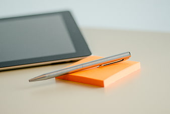
Silver pen on orange sticky notes with tablet background -
aesthetic:85
4928x3264px
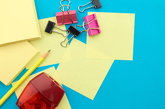
Colorful Office Supplies Flat Lay on Blue Background -
aesthetic:85
4608x3456px
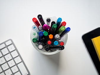
Top View of Colorful Markers in a Cup on a White Desk -
aesthetic:90
4608x3456px
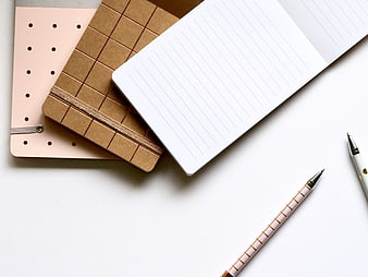
Flat lay of pink and brown notebooks with pens on white background -
aesthetic:86
5184x3456px
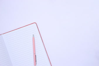
Pink Pen on Open Notebook with Blank Pages and Copy Space -
aesthetic:72
5184x3456px
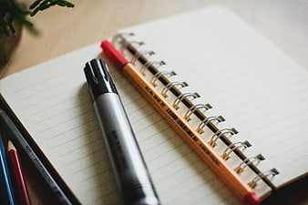
Stationery on spiral notebook with marker and pencil -
aesthetic:82
3570x2274px
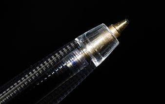
Macro Close-Up of Ballpoint Pen Tip on Black Background -
aesthetic:82
3804x2536px
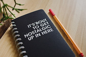
Black Notebook with Nostalgic Quote and Pencil on Desk -
aesthetic:92
4928x3264px
Colorful Colored Pencils on Yellow Background -
aesthetic:82
4608x3456px
Minimalist Peach Notebook on Wooden Desk with Pen -
aesthetic:85
5456x3632px
Close-up of colored pencils in a container -
aesthetic:85
6016x4016px
Colorful Stationery Flat Lay with Blue Background and Copyspace -
aesthetic:82
5456x3632px
Close-up of sharpened pencils in black and white -
aesthetic:88
4961x3508px
Top View Blank Paper on Wooden Desk with Coffee and Pens -
aesthetic:82
4485x3019px
Colorful Pencils with Reflection on Black Background -
aesthetic:75
5941x3929px
Hands writing on yellow sticky notes at white office desk -
aesthetic:78
4928x3264px
Blank spiral notebook and blue pen on white background -
aesthetic:79
4864x3648px
Minimalist workspace with notebook, pen, and keyboard on wooden desk -
aesthetic:85
6016x4016px
Minimalist Workspace Flat Lay with Laptop and Coffee -
aesthetic:82
6016x4016px
Colorful Flat Lay of Stationery and Crumpled Paper -
aesthetic:85
6016x4016px
Composition notebook and green pencil on colorful background -
aesthetic:85
4961x3508px
Blank white spiral notebook with pen on white background