
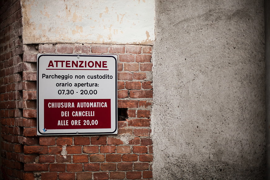
A close-up of an Italian parking sign reading 'ATTENZIONE' mounted on a textured red brick wall next to a concrete pillar. The sign details unattended parking hours and automatic gate closure times.
Tags:
PHOTO INFO
- Image Size
- 5616x3744px
- File Size
- 2.26MB
- resolution
- 5K
- License
- Commercial use free
- Aesthetic Score
- 72/100
VISUAL ATTRIBUTES OF THIS STOCK PHOTO
- Color temperature
- neutral
- Brightness
- mid_tone
- Saturation
- moderate
- Lighting Source
- natural
- Lighting Condition
- overcast
- Negative Space
- moderate
- Negative Space Location
- right
- Depth Of Field
- deep
- Has People
- none
- Season
- unknown
- Time Of Day
- afternoon
- Shot Scale
- medium
- Background Type
- textured
- Orientation
- horizontal
- Composition Style
- rule_of_thirds
- Dominant colors
- redbrownwhitegray
- Palette Style
- earthynatural
- Mood
- urbanraw
- Style
- documentarystreet
- Subject type
- architectureurban_scene
ONLINE RESIZE
aesthetic analysis & score
This is a competent, well-composed stock image with strong textural details and clear subject matter, though it lacks the unique artistic vision required for a top-tier score.
Composition & Framing score
75The rule-of-thirds placement of the sign creates a balanced composition with ample negative space on the right for text overlay.
Lighting & exposure score
70The lighting is even and diffuse, revealing texture without harsh shadows, though a slight vignette darkens the edges.
Color harmony & palette score
80The warm reds of the brick and sign contrast pleasingly with the neutral gray concrete and white sign background.
Visual impact & mood score
65The image conveys a gritty, urban atmosphere but lacks a strong emotional hook or unique artistic flair.
Technical Quality & Clarity score
85The image is sharp with excellent detail in the brickwork and clear legibility of the text on the sign.
Subject clarity & focal hierarchy score
90The sign is the undeniable focal point, clearly separated from the background by contrast and placement.
Use case suitability scores
Copyspace Layout Usability Score
85This image is suitable for text overlay layouts — the negative space in the right works for posters, banners, greeting cards and magazine covers needing headline room
Social Media Content Creation Score
60Web UI Digital Design Score
75Commercial Advertising Branding Score
50Editorial Corporate Presentation Score
70Content Marketing Publishing Score
75Ecommerce Product Showcase Score
20Market Competitiveness Score
65Related Royalty free Photos
-
aesthetic:88
2400x1600px
Red Fire Hydrant Against Textured Beige Wall -
aesthetic:82
5291x3527px
Vintage One Way Street Sign on White Brick Wall -
aesthetic:78
3000x1989px
Vintage ACE Letters on White Brick Wall -
aesthetic:76
4986x3190px

African American Man Texting Smartphone Near Garage Door -
aesthetic:76
1920x1280px
Black and white urban brick wall with fire escape -
aesthetic:88
4367x2911px
Red neon sign with motivational quote on brick wall -
aesthetic:82
3052x1717px

Together We Create Graffiti on Brick Wall -
aesthetic:80
5760x3840px
Green Cul-de-sac street sign against white brick wall -
aesthetic:82
4552x3015px
Vintage Red Brick Wall Texture Background -
aesthetic:76
3456x2304px
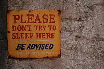
Vintage Warning Sign on Textured Concrete Wall -
aesthetic:78
3000x2000px
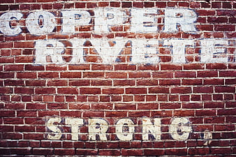
Vintage Ghost Sign on Red Brick Wall -
aesthetic:76
3400x2096px
Woman texting on smartphone on urban brick sidewalk -
aesthetic:72
5184x3456px
Textured Red Brick Wall Background -
aesthetic:85
3089x2048px
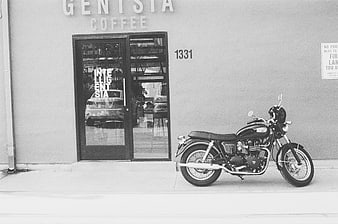
Black and white motorcycle parked outside coffee shop storefront -
aesthetic:75
5760x3840px
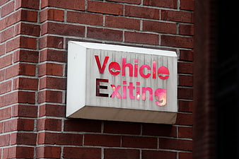
Red Vehicle Exiting Sign on Brick Wall -
aesthetic:72
2800x1867px
Red Brick Wall Texture Background -
aesthetic:84
5474x3259px
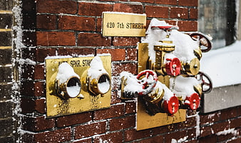
Snow-covered fire hydrant on brick wall in winter -
aesthetic:80
2800x1867px
Close-up of red brick wall texture with white mortar -
aesthetic:82
2981x4173px
Red No Entry Sign on Textured Brick Wall Corner -
aesthetic:82
2709x1811px
Man walking past construction site under elevated highway -
aesthetic:75
5710x3812px
Hello Beautiful Sign on Weathered Concrete Wall -
aesthetic:82
5472x3648px
Rustic brick wall alley with potted plants and bench -
aesthetic:78
1920x1280px
Vintage brick wall with large industrial window and green plants -
aesthetic:82
4479x2986px
Vintage Ghost Sign on Weathered Brick Wall -
aesthetic:85
5184x3456px
Vintage red tricycle chained to concrete post on sidewalk -
aesthetic:78
5760x3840px

Low angle view of ornate black street lamp against beige brick wall -
aesthetic:85
4904x3456px
Black and white street art poster on brick wall -
aesthetic:85
4306x2873px
Vintage Red Vespa Scooter Parked on City Street -
aesthetic:72
4368x2912px
Vintage Silver Bicycle Leaning Against Red Brick Wall -
aesthetic:86
3727x2485px

Man in Red Shirt Standing Against White Brick Wall -
aesthetic:78
4996x3331px
Weathered Level 5 Stairs Sign on Concrete Wall -
aesthetic:84
4768x3576px
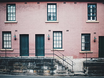
Pink brick building facade with teal doors and windows -
aesthetic:82
1920x1280px
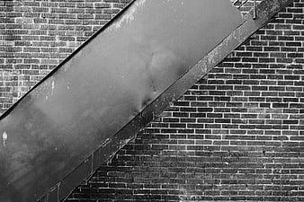
Black and White Urban Staircase on Brick Wall -
aesthetic:76
3000x2000px
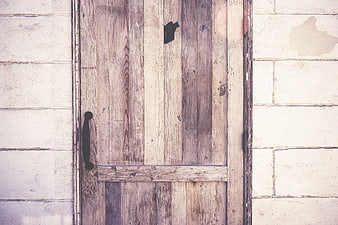
Rustic wooden door with black handle on white brick wall -
aesthetic:85
3346x3548px
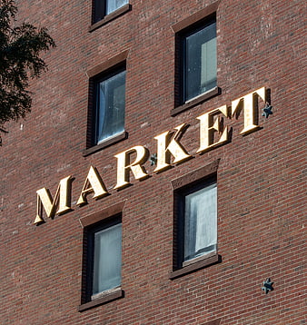
Golden Market Sign on Red Brick Building Facade -
aesthetic:78
5146x3431px
Cyclist Riding Past Brick Apartment Building Facade -
aesthetic:82
3501x2336px
Black and white urban concrete garage doors on a slope -
aesthetic:85
3648x5472px
Paris Metro Sign with Classic Haussmannian Architecture Background -
aesthetic:85
3985x2662px
Purple Door on Old Stone Wall with Green Window -
aesthetic:82
4460x2973px
Yellow Painted Brick Wall Texture Background -
aesthetic:78
5457x3638px
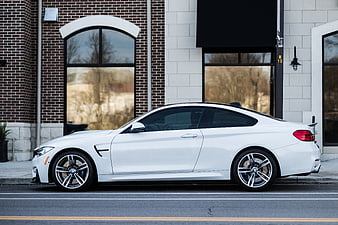
White BMW M4 Coupe Parked on City Street -
aesthetic:85
5760x3840px
Man Walking Past Brick Wall in Black and White -
aesthetic:86
5472x3648px

Colorful Mural of Hand Reaching for Key on Brick Wall -
aesthetic:68
3000x1897px
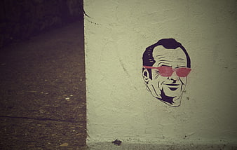
Sticker of smiling man with sunglasses on concrete wall -
aesthetic:85
3233x4850px
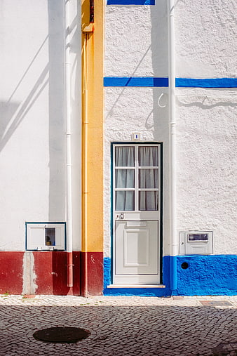
Colorful Portuguese Street Door with Blue and Yellow Walls -
aesthetic:82
5223x3482px
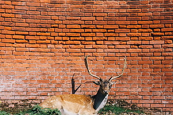
Spotted Deer Resting Against Red Brick Wall -
aesthetic:75
2088x1297px
Red Traffic Light Under Concrete Overpass -
aesthetic:90
2000x1333px
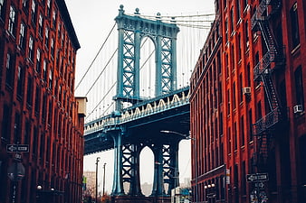
Manhattan Bridge framed by red brick buildings in DUMBO Brooklyn -
aesthetic:82
3185x2273px
No Entry Sign Against Yellow Wall with Pink Bougainvillea -
aesthetic:88
5184x3456px
Neon Ask Sign on Brick Wall -
aesthetic:82
4000x2996px
Vintage Bicycle Leaning Against Weathered Brick Wall -
aesthetic:82
4153x2336px
Vintage bicycle with basket against dark brick wall -
aesthetic:85
4000x2667px
Red Coca-Cola Delivery Truck on City Street -
aesthetic:82
3079x1733px
Weathered Concrete Apartment Building Facade with Windows -
aesthetic:75
6000x4000px
Old weathered wooden door in crumbling brick wall -
aesthetic:82
4000x6000px
Old barred window in weathered brick wall -
aesthetic:88
2973x4460px
Symmetrical subway stairs leading to city exit -
aesthetic:80
1152x1533px
Textured Red Brick Wall Background with White Mortar -
aesthetic:86
3264x2448px

Abstract geometric mural on textured brick wall -
aesthetic:85
4459x2509px
Green Car Parked on Street with Pedestrians and Wall