
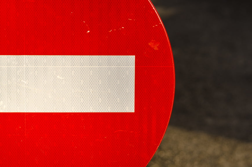
Detailed close-up view of a red circular no entry traffic sign featuring a white horizontal bar. The reflective surface texture is clearly visible against a blurred asphalt background, offering ample copyspace for text.
Tags:
PHOTO INFO
- Image Size
- 4842x3207px
- File Size
- 924.71KB
- resolution
- 4K
- License
- Commercial use free
- Aesthetic Score
- 82/100
VISUAL ATTRIBUTES OF THIS STOCK PHOTO
- Color temperature
- neutral
- Brightness
- mid_tone
- Saturation
- vibrant
- Lighting Source
- natural
- Lighting Condition
- overcast
- Negative Space
- large
- Negative Space Location
- right
- Depth Of Field
- shallow
- Has People
- none
- Season
- unknown
- Time Of Day
- unknown
- Shot Scale
- close_up
- Background Type
- blurred_bokeh
- Orientation
- horizontal
- Composition Style
- close_up
- Dominant colors
- redwhitegray
- Palette Style
- vibrant
- Mood
- professionalcaution
- Style
- documentary
- Subject type
- traffic sign
ONLINE RESIZE
aesthetic analysis & score
This image excels as a functional stock asset due to its bold color contrast, sharp detail, and excellent layout for text overlay, making it highly desirable for safety and traffic-related content.
Composition & Framing score
85The off-center framing creates a strong diagonal curve that leads the eye while leaving significant negative space on the right for text overlay.
Lighting & exposure score
80Even, diffuse lighting highlights the texture of the reflective material without creating harsh shadows or blown-out highlights.
Color harmony & palette score
90The striking contrast between the vibrant red and clean white creates a visually arresting and universally recognizable color combination.
Visual impact & mood score
75The bold red color commands immediate attention and conveys a clear sense of authority and caution.
Technical Quality & Clarity score
85Sharp focus on the sign's surface reveals fine details like the retroreflective texture and minor wear, indicating high technical quality.
Subject clarity & focal hierarchy score
90The subject is unmistakable, with the bright red and white elements dominating the frame against a dark, out-of-focus background.
Use case suitability scores
Copyspace Layout Usability Score
95This image is suitable for text overlay layouts — the negative space in the right works for posters, banners, greeting cards and magazine covers needing headline room
Social Media Content Creation Score
70Web UI Digital Design Score
80Commercial Advertising Branding Score
75Editorial Corporate Presentation Score
85This image is suitable for editorial and corporate presentations — slide decks, annual reports, press releases, internal newsletters and conference presentation backgrounds
Content Marketing Publishing Score
80Ecommerce Product Showcase Score
40Market Competitiveness Score
85Related Royalty free Photos
-
aesthetic:82
5808x3872px
No Parking Any Time Sign on Blue Tarp Background -
aesthetic:76
5184x3456px
Yellow Warning Lights on Construction Barrier -
aesthetic:88
3664x2748px
Yellow Dead End Road Sign Against Blue Sky -
aesthetic:82
3781x2613px
Close-up of red warning light on construction site -
aesthetic:85
1920x1080px
Red Stop Signs Bordering White Copy Space -
aesthetic:78
3872x2592px
Red Stop Sign Against Blue Sky -
aesthetic:78
6016x4016px
Orange Traffic Cone on Asphalt Road with Copyspace -
aesthetic:82
7882x5257px
Red Yield Traffic Sign Against Blue Sky -
aesthetic:88
3644x5466px
Railroad Crossing Signal with Red Warning Lights -
aesthetic:82
5170x3444px
Red Stop Sign Painted on Asphalt Road Surface -
aesthetic:78
5816x3836px
Orange traffic cone on asphalt road with copyspace -
aesthetic:80
3508x4909px
Railroad crossing signal with red light and crossbuck sign -
aesthetic:72
7288x4861px
Do Not Enter Sign on Green Gate in Rural Landscape -
aesthetic:72
2857x1465px
Pedestrian Crossing Signal with Walk Symbol on Urban Street -
aesthetic:78
8192x5464px
Road Closed to Thru Traffic Sign on Asphalt -
aesthetic:85
3072x3139px
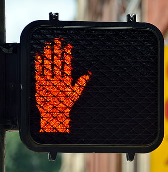
Close-up of red hand pedestrian stop signal -
aesthetic:78
1536x2304px
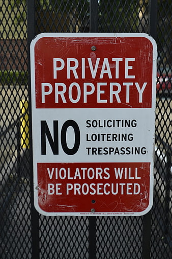
Private Property No Trespassing Sign on Metal Fence -
aesthetic:82
8192x5464px
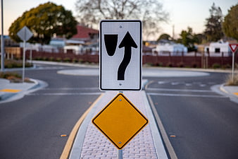
Traffic Keep Right Sign on Suburban Roundabout -
aesthetic:88
3264x2448px
Close-up of Amber Warning Light Lens Texture -
aesthetic:85
1984x1984px
Close-up of Red Traffic Light Signal with Reflections -
aesthetic:78
1440x1920px
Orange Traffic Cone with Reflective Stripe on Metal Surface -
aesthetic:88
3264x2448px
Close-up of Amber Warning Light Lens with Concentric Rings -
aesthetic:82
3592x2056px
Close-up of Red Stop Sign on Roadside -
aesthetic:85
2183x3274px
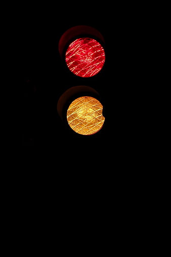
Close-up of red and yellow traffic lights at night -
aesthetic:75
4067x2745px
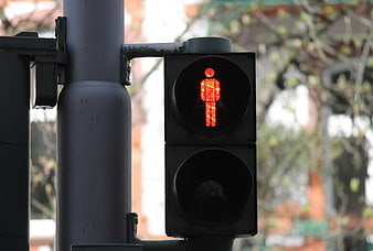
Red Pedestrian Traffic Light Signal Close-Up -
aesthetic:72
3216x2136px
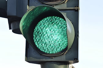
Close-up of Green Traffic Light Signal Against Sky -
aesthetic:72
2448x3264px
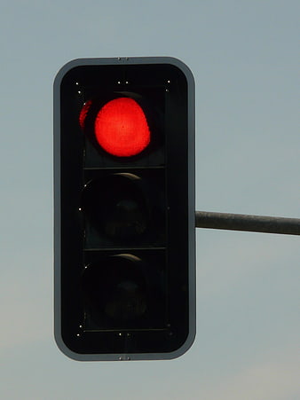
Red traffic light signal against a clear blue sky -
aesthetic:76
1930x2573px
Close-up of stacked orange traffic cones with reflective stripes -
aesthetic:80
3500x4253px
Red Traffic Light in Front of Yellow Building -
aesthetic:88
5184x3456px
Close-up of bicycle traffic light with red signal at night -
aesthetic:78
3000x4000px
Red Pedestrian Traffic Light Signal Close Up -
aesthetic:82
4004x6011px
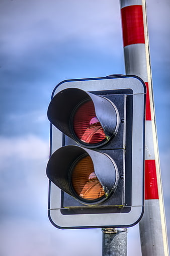
Close-up of red and amber railroad crossing traffic signal -
aesthetic:88
4928x3264px
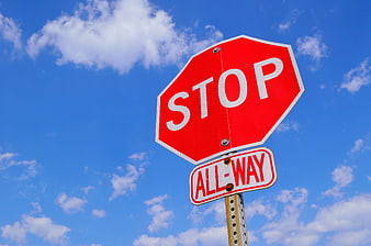
Red Stop Sign Against Blue Sky with Clouds -
aesthetic:85
4000x2248px
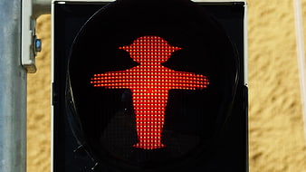
Red East German Ossi Ampelmännchen Pedestrian Traffic Light Signal -
aesthetic:85
2248x4000px
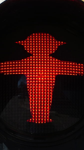
Close-up of red East German Ossi traffic light pedestrian signal -
aesthetic:78
3000x4000px
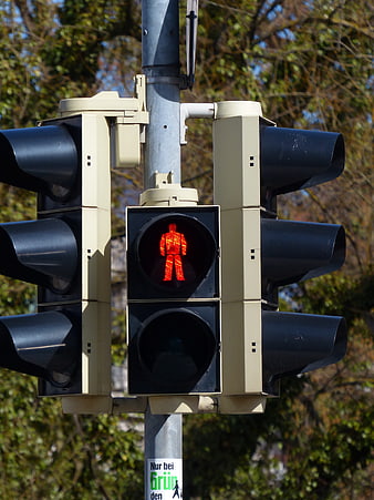
Red Pedestrian Traffic Light Signal Close Up -
aesthetic:78
3072x2048px
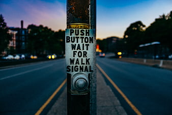
Close-up of Push Button Wait for Walk Signal on Street Pole -
aesthetic:82
4000x2248px
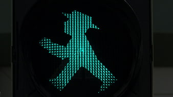
Close-up of green East German pedestrian traffic light signal -
aesthetic:78
8192x5464px
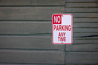
No Parking Any Time Sign on Weathered Green Wood Wall -
aesthetic:82
2260x1932px
Yellow pedestrian crossing button on metal pole with blurred street background -
aesthetic:85
4000x2248px
Close-up of illuminated green pedestrian traffic light signal -
aesthetic:82
3504x2336px
Blue One Way Traffic Sign with Arrow Against Sky -
aesthetic:86
2144x1424px
Red traffic light with heart shape symbol -
aesthetic:78
6000x4000px
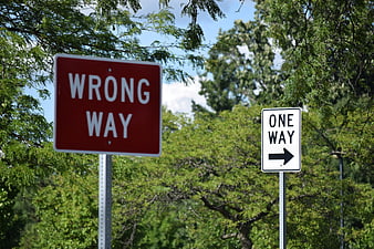
Red Wrong Way and White One Way Street Signs -
aesthetic:82
4440x2960px
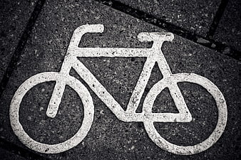
White Bicycle Symbol Painted on Dark Asphalt Pavement -
aesthetic:82
4608x3072px
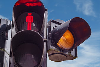
Pedestrian Traffic Light Signal With Red Stop Figure And Amber Light -
aesthetic:88
3333x2450px

Yellow Hard Hat Under Construction Isolated on White Background -
aesthetic:78
3456x2304px
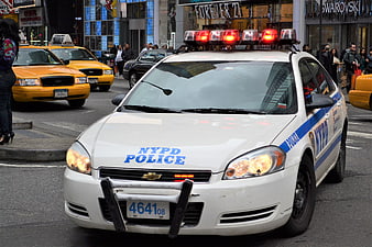
NYPD Police Car with Sirens in New York City Traffic -
aesthetic:75
5808x3872px
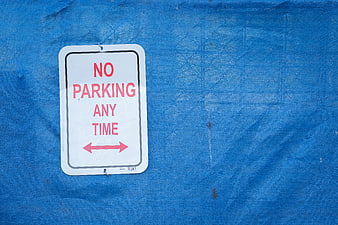
No Parking Any Time Sign on Blue Tarp Background -
aesthetic:72
7288x4861px
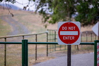
Red Do Not Enter Sign on Green Gate -
aesthetic:88
1062x708px
Close-up of glowing red traffic stop light lens