
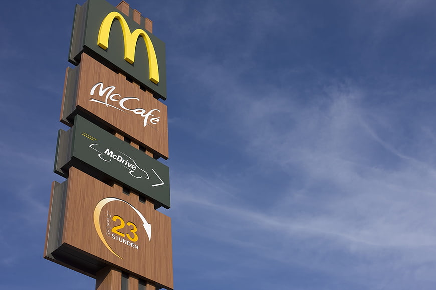
A low-angle shot of a McDonald's sign tower featuring the Golden Arches, McCafe, and McDrive logos against a blue sky. The sign also displays 24-hour service text in German.
Tags:
PHOTO INFO
- Image Size
- 2500x1667px
- File Size
- 164.8KB
- resolution
- 1080P
- License
- Commercial use free
- Aesthetic Score
- 86/100
VISUAL ATTRIBUTES OF THIS STOCK PHOTO
- Color temperature
- cool
- Brightness
- mid_tone
- Saturation
- vibrant
- Lighting Source
- natural
- Lighting Condition
- midday
- Negative Space
- large
- Negative Space Location
- right
- Depth Of Field
- deep
- Has People
- none
- Season
- unknown
- Time Of Day
- afternoon
- Shot Scale
- medium
- Background Type
- natural_scene
- Orientation
- horizontal
- Composition Style
- diagonal
- Dominant colors
- yellowbrownblue
- Palette Style
- natural
- Mood
- professional
- Style
- commercial_advertising
- Subject type
- architecture
ONLINE RESIZE
aesthetic analysis & score
This is a high-quality, commercially viable image that effectively showcases the McDonald's brand identity with excellent clarity, composition, and color harmony.
Composition & Framing score
85The low-angle perspective emphasizes the height of the sign tower, while the placement on the left creates a strong diagonal line and ample negative space on the right.
Lighting & exposure score
90The lighting is bright and even, clearly illuminating the textures of the wood and the details of the logos without harsh shadows or overexposure.
Color harmony & palette score
88The iconic yellow and red of the McDonald's branding contrast beautifully with the natural wood tones and the deep blue of the sky.
Visual impact & mood score
80The image conveys a sense of familiarity and reliability associated with the global brand, set against a clean, open sky.
Technical Quality & Clarity score
92The image is sharp and detailed, with clear visibility of the text and logos, indicating high-resolution capture.
Subject clarity & focal hierarchy score
95The McDonald's logo at the top immediately draws the eye, followed by the sub-brands, creating a clear visual hierarchy.
Use case suitability scores
Copyspace Layout Usability Score
85This image is suitable for text overlay layouts — the negative space in the right works for posters, banners, greeting cards and magazine covers needing headline room
Social Media Content Creation Score
75Web UI Digital Design Score
80Commercial Advertising Branding Score
90This image is suitable for commercial advertising and branding — brand campaigns, display ads, product packaging, brochures, and outdoor billboard visuals
Editorial Corporate Presentation Score
85This image is suitable for editorial and corporate presentations — slide decks, annual reports, press releases, internal newsletters and conference presentation backgrounds
Content Marketing Publishing Score
80Ecommerce Product Showcase Score
60Market Competitiveness Score
85Related Royalty free Photos
-
aesthetic:65
4898x3265px
Illuminated McDonald's Golden Arches Sign at Night -
aesthetic:82
2048x1536px
Illuminated McDonald's sign with glowing golden arches and McDrive text at night -
aesthetic:85
4272x2848px
Vintage orange hotel sign against blue sky -
aesthetic:85
5472x3648px
Woman Eating McDonald's French Fries Outdoors -
aesthetic:82
5400x3790px
Chef preparing food at a busy outdoor food market stall -
aesthetic:82
7952x5304px
Glowing Red and Blue Neon Open Sign at Night -
aesthetic:88
3168x4752px
Neon Coffee Cup Sign with Glowing Text on Black Background -
aesthetic:80
5456x3632px
Blue Pedestrian Sign with Adult and Child Symbol Against Sky -
aesthetic:85
2500x1667px

Blank wooden directional signpost against blue sky with clouds -
aesthetic:82
7882x5257px
Red Yield Traffic Sign Against Blue Sky -
aesthetic:78
3200x2400px
Neon Burger Restaurant Sign in Dark Interior -
aesthetic:88
4884x3053px
Vintage Jackass Gas Station Sign Against Blue Sky -
aesthetic:88
3815x5682px
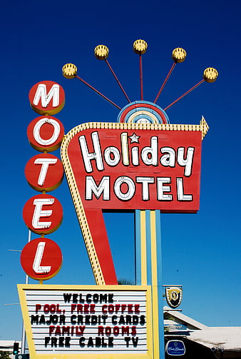
Vintage Holiday Motel Sign Against Clear Blue Sky -
aesthetic:72
4460x2512px
Low angle view of restaurant building against blue sky -
aesthetic:82
3508x2480px
Empty Yellow Road Sign Mockup Against Blue Sky And Clouds -
aesthetic:78
2276x1518px
Red Wrong Way Traffic Sign Against Blue Sky -
aesthetic:76
3008x2000px
Vintage Blue Bowling Sign on Weathered White Building Exterior -
aesthetic:85
7200x4800px
Yellow Motel Sign in Front of Palm Tree -
aesthetic:85
2560x1920px
Yellow Facebook Sign Against Blue Sky -
aesthetic:88
4928x3264px
Red Stop Sign Against Blue Sky with Clouds -
aesthetic:78
2232x1502px
Mel's Drive-In Neon Sign at Night in San Francisco -
aesthetic:88
5275x3517px
Asphalt road through golden autumn forest with blue sky -
aesthetic:88
6000x4000px
Traffic Lights and Directional Signs Against Blue Sky -
aesthetic:82
4000x2672px
Vibrant Sunflowers Against Clear Blue Sky With Bees -
aesthetic:90
4028x3028px
Majestic Old Beech Tree with Golden Autumn Foliage Against Blue Sky -
aesthetic:86
5794x3863px
Detailed Blue Islamic Architecture with Intricate Tile Patterns -
aesthetic:78
6000x4000px
Ancient Stone Arch Ruins In Snowy Winter Landscape -
aesthetic:88
3800x2533px
Retro Diner Sign Against Blue Sky -
aesthetic:82
7952x5304px
Red and Blue Neon Open Sign in Window -
aesthetic:82
7952x5304px
Glowing Red and Blue Neon Open Sign at Night -
aesthetic:82
4460x2512px
Retro Restaurant Building Sign Against Blue Sky -
aesthetic:82
1062x708px
Eat In or Takeaway Text on Restaurant Window -
aesthetic:78
1062x708px
Vintage Red Tractor in Front of Gelato Shop -
aesthetic:88
3008x2000px
Golden pampas grass plumes swaying against a blue sky -
aesthetic:78
5184x3456px
Green directional signpost for World of Coca-Cola and Pemberton Cafe -
aesthetic:85
5527x7151px
Sunlit Forest Road in Golden Autumn -
aesthetic:72
4608x3456px

Close-up of metal chain links against blue sky -
aesthetic:85
5456x3632px
Yellow autumn leaves against blue sky with airplane contrail -
aesthetic:88
2692x4033px
Rustic wooden sign at Dollinger Pumpkins farm entrance -
aesthetic:88
4608x3456px
Red maple leaves against a clear blue autumn sky