
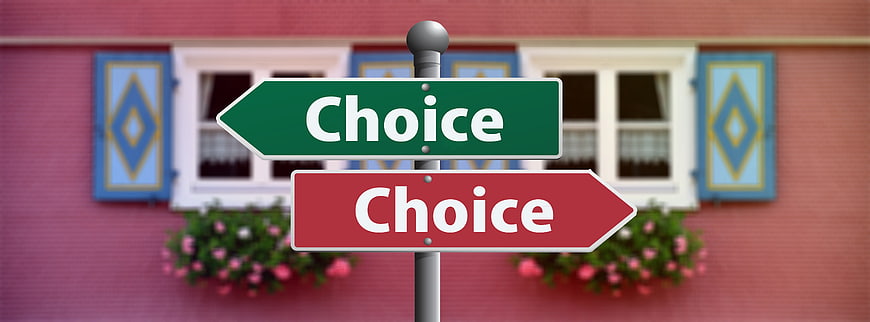
A conceptual image featuring two directional signs, one green and one red, both labeled 'Choice' and pointing in opposite directions. Set against a blurred background of a pink house with blue shutters, this visual metaphor represents decision-making, alternatives, and crossroads.
Tags:
PHOTO INFO
- Image Size
- 6000x2224px
- File Size
- 450.84KB
- resolution
- 5K
- License
- Commercial use free
- Aesthetic Score
- 78/100
VISUAL ATTRIBUTES OF THIS STOCK PHOTO
- Color temperature
- neutral
- Brightness
- mid_tone
- Saturation
- vibrant
- Lighting Source
- natural
- Lighting Condition
- overcast
- Negative Space
- moderate
- Negative Space Location
- top
- Depth Of Field
- shallow
- Has People
- none
- Season
- unknown
- Time Of Day
- unknown
- Shot Scale
- medium
- Background Type
- blurred_bokeh
- Orientation
- horizontal
- Composition Style
- centered
- Dominant colors
- greenredpinkblue
- Palette Style
- vibrant
- Mood
- professionalinspirational
- Style
- conceptual
- Subject type
- signpost
ONLINE RESIZE
aesthetic analysis & score
The image is a strong conceptual representation of choice, with clear subject matter and effective use of color and composition. The slightly generic background prevents it from reaching the highest tier, but it remains a visually appealing and useful stock image.
Composition & Framing score
85The centered composition effectively highlights the signpost as the focal point, with the blurred background providing context without distraction.
Lighting & exposure score
80The lighting is even and bright, ensuring the text on the signs is clearly legible and the colors are vibrant.
Color harmony & palette score
75The contrasting green and red signs create a strong visual impact, while the pink and blue background adds a complementary, albeit slightly busy, color scheme.
Visual impact & mood score
70The image effectively conveys the concept of choice and decision-making, though the somewhat generic background limits its overall visual impact.
Technical Quality & Clarity score
85The image is sharp and clear, with the signs in focus and the background appropriately blurred to emphasize the subject.
Subject clarity & focal hierarchy score
90The signpost is the clear focal point, with the text 'Choice' prominently displayed on both signs, leaving no ambiguity about the subject.
Use case suitability scores
Copyspace Layout Usability Score
60Social Media Content Creation Score
75Web UI Digital Design Score
70Commercial Advertising Branding Score
65Editorial Corporate Presentation Score
80Content Marketing Publishing Score
75Ecommerce Product Showcase Score
40Market Competitiveness Score
70Related Royalty free Photos
-
aesthetic:85
6000x2224px
Blank Red and Green Directional Signpost in Front of Pink House -
aesthetic:78
8000x4203px

Chalkboard with word choice and directional arrows -
aesthetic:82
4900x2183px

Yellow directional signpost with blurred city background -
aesthetic:82
2560x1793px
Black street signs reading Chance against blue sky -
aesthetic:85
6000x4000px

Blank White Directional Signpost Against Blue Sky -
aesthetic:82
2560x1920px
Street sign pointing to truth and lie against blue sky -
aesthetic:82
4900x2183px

Blue directional signpost with blank arrows on abstract background -
aesthetic:78
4900x2183px

Blue and red directional signpost with this way and that way text -
aesthetic:80
3532x2355px
Aerial view of rural house at crossroads in green field -
aesthetic:78
3600x2000px

3D Scale with Question Marks Symbolizing Decision Making -
aesthetic:72
1920x952px

Businesswoman holding sign with choice, chance, change text -
aesthetic:82
2560x1920px

Yellow road sign with share and not to share text -
aesthetic:85
2309x1726px
Vintage street sign pointing to peace and war against cloudy sky -
aesthetic:82
2309x1745px
Street sign pointing to possible and impossible against blue sky -
aesthetic:80
4000x1331px

Wooden Directional Signpost Against Snowy Mountain Background -
aesthetic:85
3228x4842px
Red Wooden Directional Signpost in Forest -
aesthetic:82
2048x1536px

Green road sign with learning arrows on highway -
aesthetic:78
5472x3648px
Wooden stairs ascending a grassy hill with fork in path -
aesthetic:82
4047x2698px

Wooden sign reading second chance with silhouette at sunset -
aesthetic:82
5939x3152px

Businessmen holding sign saying try again with thumbs up -
aesthetic:82
4016x6016px
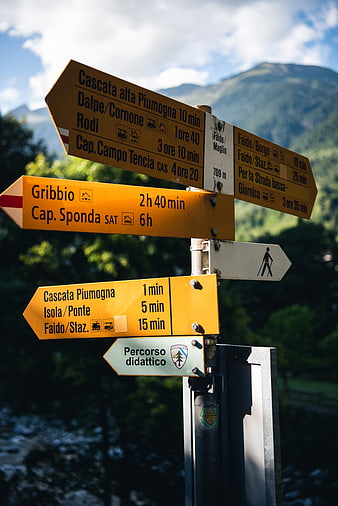
Yellow Hiking Trail Signpost in Mountain Valley -
aesthetic:75
3698x2690px
Vulture on desert signpost with phone and chef icons -
aesthetic:82
5100x2898px
Desert signpost with lost found searching text and red rocks -
aesthetic:78
4016x6016px
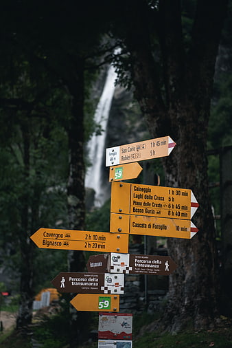
Hiking trail signs with waterfall background in Italian Alps -
aesthetic:85
6000x2988px

Second chance text written in clouds against blue sky -
aesthetic:85
3008x2148px
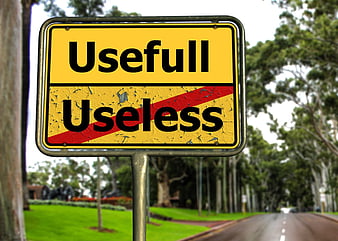
Useful vs Useless Road Sign Concept -
aesthetic:85
2336x1768px
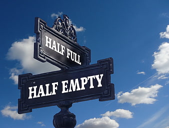
Half Full Half Empty Street Sign Against Blue Sky -
aesthetic:75
3456x2304px
Black and white road arrows pointing in opposite directions on asphalt -
aesthetic:88
3216x2136px
Blue street sign pointing left with word ignorance